San Jose Earthquakes
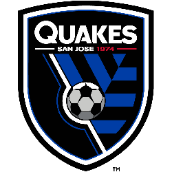
A black with white and black trim, with shortened team nickname “QUAKES” in white above city name “San Jose” and establishment year. A soccer ball is shown in between a blue and black pattern. This pattern represents the shifting tectonic plates during an earthquake.
San Jose Earthquakes
2014 - Present
Wordmark "EARTHQUAKES" in black and "SAN JOSE" in black also "1974" in red above the primary logo.

San Jose Earthquakes
2000 - 2005
A blue, black, white and silver earth splitting electricity under a black, white and grey soccer ball.

San Jose Earthquakes
2000 - 2005
A black and white soccer ball with yellow eyes peering over a wordmark "EARTHQUAKES" in blue with white trim on a black formed background on a cracking electricity earth.

San Jose Earthquakes
2000 - 2005
A black and white cracking soccer ball on a black and blue shield with wordmark "EARTHQUAKES" in blue with white trim on a black formed background and a black ribbon with the wordmark "SAN JOSE" in white at the bottom.

San Jose Earthquakes
2000 - 2005
A white and black soccer ball with yellow sun rays inside blue with white and black trim shield. A black banner across the top with a wordmark "SAN JOSE" in white and "EARTHQUAKES" in blue with white trim and a white seismograph line going through the wordmark.

San Jose Earthquakes
2000 - 2005
A white and black soccer ball with silver sun rays inside blue with white and black trim shield. A black banner across the top with a wordmark "SAN JOSE" in white and "EARTHQUAKES" in blue with white trim and a white seismograph line going through the wordmark.
A lighter shade of blue from the primary logo.

San Jose Earthquakes Alternate Logo
The San Jose Earthquakes logo history is defined by its connection to the seismic activity of the Silicon Valley region. Consequently, the San Jose Earthquakes alternate logo often features the "SJ" monogram set against jagged patterns that represent shifting tectonic plates. These designs emphasize the "Blue, Black, and Silver" color palette that fans recognize worldwide. You can find more specific branding details on the Earthquakes team history page.
Furthermore, the San Jose Earthquakes logo history reached a milestone in 2014 with a complete rebrand to celebrate the club's 40th anniversary. Fans often search for a San Jose Earthquakes logo PNG to highlight the chevron patterns, which symbolize the "unity" of the team and its supporters. While the primary shield is the main face, the San Jose Earthquakes wordmark logo provides a clean typographic alternative for various digital media.
In short, the San Jose Earthquakes logo history reflects a journey of professional growth and community pride. Every San Jose Earthquakes alternate logo used in marketing reinforces the club's identity as a resilient force in the Western Conference. Therefore, the high-quality San Jose Earthquakes logo PNG remains an essential asset for fans who follow the "Goonies never say die" spirit. This visual identity continues to inspire the "Ultras" and soccer enthusiasts across the Bay Area.


