Minnesota United FC
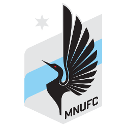
A blue and grey crest with a black with a red-eye loon, a grey North Star, a blue stripe in the middle of the crest and the initials “MNUFC” in black diagonally at the bottom.
Minnesota United FC
2017 - Present
A blue and grey crest with a black with a red-eye loon, a grey North Star, a blue stripe in the middle of the crest and the initials “MNUFC” in black diagonally at the bottom.
Minnesota United FC Primary Logo
The Minnesota United FC primary logo is rich with regional meaning, featuring the loon, Minnesota's state bird. Within the Minnesota United FC logo history, the crest's grey colors represent the Iron Range, while the blue stripe depicts the Mississippi River. This Minnesota FC logo also includes a star representing the "L'Etoile du Nord." For more on the club's journey, visit our Minnesota United FC team history page.
Central to the Minnesota FC logo are elements reflecting progress and nature, such as upward-pointing chevrons and nods to local landmarks like Minnehaha Falls. The Minnesota United FC primary logo captures a spirit of unity and ambition essential for success. As you track the Minnesota United FC logo history, you will notice how these details create a sense of belonging. To see different branding variations, visit the Minnesota United FC alternate logo page.
The Minnesota United FC logo history reflects a commitment to the community through symbols like thirteen stars, representing unity across the nation. Every Minnesota United FC primary logo iteration manages to capture the state’s heritage while staying true to the core values of the sport. Whether analyzing the Minnesota FC logo or the club’s growth, the primary crest remains a powerful emblem of strength through determination for the MNUFC family in 2026.
College Sports Fan Products


Minnesota United FC Fans Time to Vote
Brace yourself for the MLS Team Logo Battle by backing the resilient identity of Minnesota United FC. The iconic loon with uplifted wings set against a starry backdrop symbolizes unity, strength, and relentless ambition. More than a crest, it reflects the club’s steady rise and competitive grit within Major League Soccer, boldly facing rival emblems in the ultimate showdown.
Deeply rooted in the pride of Minnesota, the logo captures loyalty and perseverance. The soaring loon conveys determination and forward momentum, making the emblem a powerful statement of identity. In any logo battle, Minnesota United’s crest doesn’t just stand out—it ascends, embodying the indomitable spirit of the team and its devoted supporters.