Columbus Crew
After revealing a new name and logo within two weeks, the Columbus team has again a new name and logo. Continuing with the same theme, the newly minted name of “Columbus Crew” has added the new name to the logo and added the number “96,” representing the first MLS club to join in 1996. This logo is shaped like the Ohio flag and has a white letter “C” in the middle of a black background. The team says the letter “C” represents the Crew primarily and also the city name. A gold outline surrounds the flag with a wordmark on top: “COLUMBUS” in black and “Crew” on the bottom. The number “96” is located in the bottom right corner in white.
Crew Alternate Logo
The Columbus Crew have been one of the most successful teams in Major League Soccer (MLS) since their inception in 1996. As a result, they have had many different logos throughout their history. From classic designs to modern updates, the team has always kept up with changing trends and embraced its unique identity through various graphic symbols.
One of the most iconic alternate logos for the Crew is known as “the crest,” which was first introduced in 2000 when they won the MLS Cup that year. The logo features three stars above a shield-shaped design with black and yellow stripes, representing Ohio’s state flag colors – red, white, and blue, respectively – and four diagonal lines symbolizing each corner post on a soccer field goal frame. This design also includes an outline of Ohio at its center and two crossed swords below it, alluding to the city's namesake explorer, Christopher Columbus, who sailed into uncharted waters during his famous 1492 voyage westward from Europe.
Another famous alternate logo for The Black & Gold is called “the starburst,” which was unveiled before their 2008 season opener against D.C United at RFK Stadium. This particular emblem consists of five yellow stars arranged around an orange circle within another larger circular shape made up of alternating black-and-white stripes meant to represent both motion energy associated with sports competition while simultaneously paying homage to both past and present supporters alike who proudly wear this badge every time out there supporting the club on game day.
Finally, perhaps one lesser known but still beloved alternative mark belongs to none other than "The Claw," first used during the 2009 campaign after being inspired by fans themselves via a contest held earlier that same year where participants were asked to submit ideas new looks better reflect the team's spirit style play pitch itself - resulting winner ended being a combination between traditional lion head motif intertwined lightning bolt signifying power speed strength possessed players donning jersey come matchday!
No matter what your favorite version may be, know that behind each emblem lies decades' worth of pride, passion, dedication, and hard work put forth by the organization over the years to ensure that future generations enjoy watching them succeed even further!
Columbus Crew
2021 - Present
This the letter "C" in black pulled out of the primary logo in a custom font with a triangle in the bottom right side of the letter "C."

Columbus Crew
2021 - Present
A wordmark "CR" and "EW" in black with the number "96" in gold with black support bars throughout the numbers in the middle of the wordmark.
Columbus Crew
2021 - Present
The shape of the state of Ohio in black and gold checkers.
Columbus Crew
2015 - 2021
A black roundel logo, a minimized crest with “96” overlaid on top, a checkerboard pattern and a horizontal stripe pattern. Encircled wordmark "COLUMBUS CREW SC" in white.
Columbus Crew
1996 - 2014
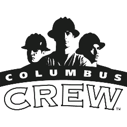
3 men with black hard hats above a wordmark "COLUMBUS" in white on a black arched background and "THE CREW" in white with black trim.
