Columbus Crew
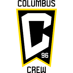
After revealing a new name and logo within two weeks, the Columbus team has again a new name and logo. Continuing with the same theme, the newly minted name of “Columbus Crew” has added the new name to the logo and added the number “96,” representing the first MLS club to join in 1996. This logo is shaped like the Ohio flag and has a white letter “C” in the middle of a black background. The team says the letter “C” represents the Crew primarily and also the city name. A gold outline surrounds the flag with a wordmark on top: “COLUMBUS” in black and “Crew” on the bottom. The number “96” is located in the bottom right corner in white.

Columbus Crew
2021 - Present
Double-lined wordmark "THE" on top in a smaller font and "CREW" in black and bold.
Font: Custom
Columbus Crew
2015 - Present
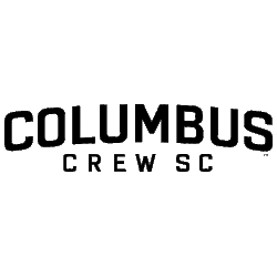
Double lined wordmark "COLUMBUS" in black and "CREW SC" below in black.
Font: Custom
Columbus Crew
1996 - 2014
Double-lined wordmark "COLUMBUS" in white on an arched black background and "CREW" below in black.
Font: Custom
Columbus Crew
1996 - 2014
Single lined wordmark "COLUMBUS CREW" in white with black trim.
Font: Custom
Columbus Crew
1996 - 2014
Single lined wordmark "COLUMBUS CREW" in black.
Font: Custom
Columbus Crew Wordmark Logo
For sports fans, the history of team logos is always an exciting topic to explore. The Columbus Crew has a vibrant and varied logo history that dates back to its founding in 1996. From their original shield-style crest to the more modern wordmark logo they use today, let’s look at how this beloved soccer club has evolved its visual identity over time!
The first official logo for the Columbus Crew debuted with their inaugural season in Major League Soccer (MLS) back in 1996. It featured a shield-style design that incorporated elements from both Ohio and soccer culture: four stars representing each corner of Ohio’s state flag; three stripes signifying movement towards victory; and two crossed hockey sticks as homage to one of America's oldest professional sports teams – also based out of Columbus! This classic crest was used until 2014 when it underwent minor updates before being retired five years later.
In 2019, after months of speculation about what direction they would go with their new branding initiative – including rumors about potentially dropping “Crew” from its name entirely – The Black & Gold unveiled an updated version of its wordmark logo, which pays tribute to both past designs while still looking forward into the future. This fresh take on traditional crests features bold black lettering outlined by gold stripes meant to evoke power & strength while simultaneously staying true to traditional colors associated with football clubs around Europe like Manchester United or AC Milan.
As we move further into 2020, it will be interesting to see if any more changes are made, either subtle or drastic, regarding The Crew's visual identity - but no matter what happens, you can rest assured knowing that there will always be something special connecting them all: A deep-rooted passion for sport, camaraderie amongst supporters, and most importantly - pride!
Soccer Sports Fan Products


