Charlotte FC
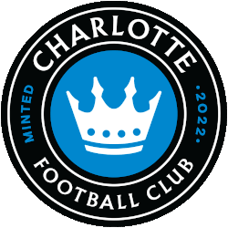
A roundel logo with wordmark “CHARLOTTE FOOTBALL CLUB” in white and “MINTED 2022” in blue on a black background. The white crown represents Queen Charlotte and the four spires for the four wards of the city.

Charlotte FC
2022 - Present
A roundel logo with wordmark "CHARLOTTE FOOTBALL CLUB" in white and "MINTED 2022" in blue on a black background. The white crown represents Queen Charlotte and the four spires for the four wards of the city.
Charlotte FC Logo History
The Charlotte FC logo history began with an interlocking “CFC” monogram. This design honors Charlotte’s heritage while using colors inspired by regional institutions. The stars above the monogram symbolize championship aspirations and connection to North Carolina’s soccer community. As part of the broader story of the club, the Charlotte FC primary logo communicates unity and competitive ambition.
High-quality Charlotte FC logo PNG assets ensure the crest appears clear across digital and print media. These scalable formats support consistent branding on merchandise, websites, and promotional materials. Fans and designers rely on Charlotte FC logo PNG files for professional presentation and accurate representation of the team’s identity.
The ongoing Charlotte FC logo history highlights the club’s growth and commitment to excellence. Since its introduction, the Charlotte FC primary logo has remained a symbol of community pride and Major League Soccer ambitions. More details about the team’s background and milestones are available on the official history page of Charlotte FC. The Charlotte FC logo history continues to document the evolution of the crest while preserving its meaning and visual identity.
College Sports Fan Products

Charlotte FC Fans Time to Vote
Plunge into the captivating MLS Team Logo Battle by rallying behind the regal identity of Charlotte FC. The circular crest featuring a crowned lion embodies majesty, strength, and competitive resolve, symbolizing the club’s rising presence within Major League Soccer. As it challenges rival logos, the emblem represents more than design—it reflects the team’s determination and the unwavering loyalty of its supporters.
Deeply rooted in the spirit of Charlotte, the logo conveys pride and ambition. The lion’s crown signifies leadership and resilience, making the crest a powerful statement in any logo showdown. In the battle for supremacy, Charlotte FC’s emblem roars with purpose, showcasing the indomitable spirit of the club and its devoted fanbase.


