Minnesota United FC
2017 - Present
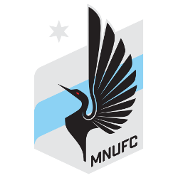
A blue and grey crest with a black with a red-eye loon, a grey North Star, a blue stripe in the middle of the crest and the initials “MNUFC” in black diagonally at the bottom.

Minnesota United FC
2017 - Present
A blue and grey crest with a black with a red-eye loon, a grey North Star, a blue stripe in the middle of the crest and the initials “MNUFC” in black diagonally at the bottom.
Minnesota United FC Primary Logo
Minnesota United FC is a professional soccer team based in Saint Paul, Minnesota. The club was founded in 2013 and joined Major League Soccer (MLS) as an expansion team in 2017. Since its inception, the team has had a unique logo that captures the spirit of Minnesota while also paying homage to its MLS roots.
The primary logo for Minnesota United FC features two overlapping circles with a shield inside them, alongside the Minnesota United FC Alternate logo. The outer circle contains thirteen stars representing each of the original thirteen colonies and symbolizing unity among all Americans regardless of their background or beliefs. Inside this circle is another one containing three chevrons pointing upward towards the sky; these represent progress, growth, and ambition - qualities that are essential to success both on and off the field for any sports organization or individual athlete alike!
Finally at center stage stands an image of Minnehaha Falls which serves as a visual representation of nature’s beauty found within our great state – something we can all celebrate together whether you’re from here originally or not! This iconic landmark pays tribute to our home city while simultaneously providing inspiration for us players every time we take to pitch wearing it proudly across our chests- reminding us what it means to be part MNUFC family: strength through unity & determination despite adversity!
Finally at center stage stands an image of Minnehaha Falls which serves as a visual representation of nature’s beauty found within our great state – something we can all celebrate together whether you’re from here originally or not! This iconic landmark pays tribute to our home city while simultaneously providing inspiration for us players every time we take to pitch wearing it proudly across our chests- reminding us what it means to be part MNUFC family: strength through unity & determination despite adversity!
College Sports Fan Products

Minnesota United FC Fans Time to Vote
Brace yourself for the exhilarating MLS Team Logo Battle, where Minnesota United FC's logo, a symbol of our hardy spirit and steadfast resilience, valiantly squares off against the symbols of rival teams. Our logo, an iconic emblem featuring a loon with uplifted wings set against a starry backdrop, is more than just a design—it's a testament to our team's inspiring history and enduring strength. This emblem, deeply rooted in the spirit of Minnesota, encapsulates the essence of Minnesota United FC—tenacious, relentless, and fiercely loyal. As Minnesota United FC fans, we proudly wear this emblem, a badge of unwavering support. Join us in this thrilling competition as our logo soars its way to supremacy, embodying the indomitable spirit of Minnesota United FC and its devoted fans. Let's show them that our logo doesn't merely stand out—it ascends, symbolizing Minnesota's relentless determination and unwavering pride in its team!

