Toronto FC
2010 - Present
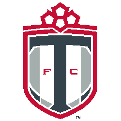
A stylized white and red maple leaf on top of a white and grey shield with a dark grey letter “T” and a red ribbon across it the center with a wordmark “TORONTO” in white. A shade of red was darkened slightly for the 2010 season.
Toronto FC Alternate Logo
Toronto FC's alternate logo history is an interesting one. The club was founded in 2006 and the first alternate logo they used was a shield with two red maple leaves, representing Canada, on either side of a white soccer ball, alongside the Toronto FC Wordmark logo. This symbolized Toronto FC’s commitment to being Canada’s premier soccer team and its connection to the city of Toronto. In 2011, this design was updated with some minor changes such as adding an outline around the shield and changing the font used for “Toronto FC” written across it.
In 2013, Toronto FC unveiled its third alternate logo which featured a large red TFC letter mark surrounded by four stars that represented each province in Canada: Ontario (blue), Quebec (white), Nova Scotia (green), and New Brunswick (yellow). This design also included three stripes at its base which were intended to represent the unity between fans from all parts of North America who support Toronto FC together despite their geographic distances apart from each other. Furthermore, this new crest had more modern fonts than before making it look even more contemporary than previous designs while still maintaining elements that made them distinctively Torontonian.
Finally, in 2018, the fourth version of their alternative emblem came out featuring mainly only two colors - black & grey – along with subtle hints of blue & yellow throughout. It features both old & new elements like incorporating 'The Six' nickname into a wordmark alongside traditional symbols like maple leaf combined with modern typography giving us what can be considered as the most sophisticated iteration yet! All these logos have been part of creating a unique identity for the team over the years while staying true to the values they stand for - celebrating Canadian culture, and diversity within the fan base & paying homage to the beautiful game itself!
Toronto FC
2007 - Present
A stylized white and red maple leaf on top of a white and grey shield with a dark grey letter "T."
