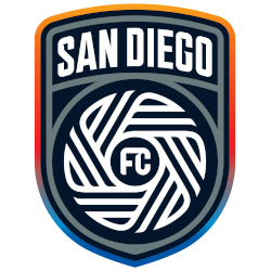
San Diego FC
The club’s official colors were labeled in the explainer as “chrome and azul,” while the crest is said to center around four “principal virtues” that define San Diego: “Gratitude, pride, not loud, diversity and a state of flow.” That flow motif is evident in the central portion of the crest, which the club points out consists of “18 lines representing the 18 communities of San Diego County.”

San Diego FC Wordmark Logo
The San Diego FC logo history is a fresh story in Major League Soccer. The club chose a very bold and modern path for its brand. Therefore, the San Diego FC wordmark logo uses a custom typeface that looks like moving water and light. This style uses "Chrome" and "Azure Blue" to represent the Pacific Ocean and the city's bright future. You can find more details about these branding choices on the San Diego FC History page.
The San Diego FC logo history highlights the unity of the 18 different communities in the region. Fans often look for the San Diego FC wordmark logo to see how it fits with the "Flow" symbol. The San Diego FC logo meaning is found in the 18 lines that form the central crest. While the wordmark is great for hats and shirts, the San Diego FC Primary logo is the main shield on the field. These elements show the club's "We Are San Diego" spirit.
In short, the San Diego FC logo history reflects a team built for the community. Every version of the San Diego FC wordmark logo helps the club stand out in a busy sports market. Because the look is so unique, the San Diego FC logo meaning resonates with fans at Snapdragon Stadium. This visual style continues to inspire local supporters and soccer enthusiasts everywhere. It brings a sleek and authoritative charm to the "Chrome and Blue" era.
Soccer Sports Fan Products