Real Salt Lake
Initials “RSL” in gold and red located in the center and around the initials are circles in both red and gold under a gold crown with a gold, white and red soccer ball inside a blue with a red and gold trim shield.

Real Salt Lake
2005 - Present
Wordmark "ReAL" in blue with gold trim and a gold crown above the letter "e" and "SALT LAKE" in red.
Font: Sans-serif
https://www.fontsquirrel.com/fonts/list/classification/serif
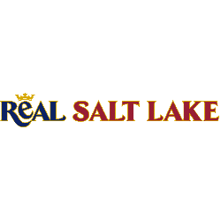
Real Salt Lake
2005 - Present
Single-lined wordmark "ReAL" in blue with gold trim and a gold crown above the letter "e" and "SALT LAKE" in red with gold trim.
Font: Sans-serif
https://www.fontsquirrel.com/fonts/list/classification/serif

Real Salt Lake
2005 - Present
Wordmark "ReAL SALT LAKE" in white and a gold crown above the letter "e" on blue mountains with gold and red stripe.
Font: Custom
Real Salt Lake Wordmark Logo
The first iteration of this logo was unveiled in 2004 when Real Salt Lake joined Major League Soccer (MLS). It featured two mountains on either side with “RSL” written between them and a bright red star at its center. This design was meant to symbolize strength, resilience, and unity within the community that supports RSL both on and off the field. Additionally, it pays homage to Utah's rugged terrain which often serves as inspiration for players during games or training sessions alike.
In 2011, Real Salt Lake underwent a rebranding effort which included updating its wordmark logo slightly by removing one mountain from each side but keeping all other elements intact; including “RSL” written between them along with the bright red star at its center standing for strength and unity among fans across all ages groups who support RSL passionately no matter what happens throughout any given season or game day experience! Today this modified version remains unchanged – serving as an enduring reminder that even though times may change over time – our commitment towards excellence will remain constant!
Soccer Sports Fan Products


