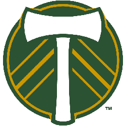
Portland Timbers
2019 - Present
A green with an orange trim circle with a superimposed white ax and orange strokes coming from the ax.
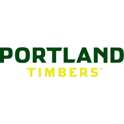
Portland Timbers
2015 - Present
Double lined wordmark "PORTLAND" in green and "TIMBERS" in yellow.
Font: Sans-serif
https://www.fontsquirrel.com/fonts/list/classification/serif
Timbers Wordmark Logo
The Portland Timbers have a long and storied history, dating back to their founding in 1975, alongside the Portland Timbers Primary logo. The team has had several logos over the years, but one of the most iconic is its wordmark logo. This logo features bold green letters spelling out “Portland Timbers” against a white background with an image of a Douglas fir tree in between each letter. The original version was first used from 1977-1982 and then reintroduced for the 2009 season when they joined Major League Soccer (MLS).
Since its introduction, this logo has become synonymous with Portland soccer culture and can be seen all around town on flags, t-shirts, hats, and other merchandise. It's also been featured prominently at home games where it adorns banners hung up inside Providence Park as well as scarves worn by fans during matches. In addition to being aesthetically pleasing due to its bright colors and simple design elements; it serves as an important reminder that no matter how much time passes or how many changes occur within MLS – there will always be one constant: The Portland Timbers are here to stay!
The wordmark logo is more than just another piece of branding though; it represents decades worth of passion for soccer amongst both players & supporters alike who've made sure that this club remains alive & kicking since day one! Whether you're attending your first match or cheering them on from afar – seeing this emblem proudly displayed reminds us all why we love supporting our beloved team so much: For Community Unity & Unconditional Support through thick & thin - Go Timbers!!!
Soccer Sports Fan Products


