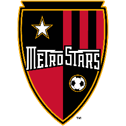
MetroStars
2002 - 2005
Wordmark "MetroStars"in white and a custom font on a red and black shield with

MetroStars
1998 - 2005
Wordmark "MetroStars" in white on a black with red trim formed background. A white lightning bolt going across the wordmark.
Font: Custom
MetroStars Wordmark Logo
The MetroStars wordmark logo has been a prominent part of the Major League Soccer (MLS) team’s identity since 1996. The logo features a bold red “M” with white stars, representing the team's name and their home city of New York. It is one of the most recognizable logos in all professional sports and has become an iconic symbol for MLS fans across North America.
The original version was designed by designer Tom O'Grady in 1996 when he was asked to create a unique brand identity for what would be known as MetroStars at that time. His design featured two overlapping circles containing five stars each which represented both the city skyline and its soccer heritage—five boroughs connected by bridges over water; it also included an abstract letter M inside them to represent MetrosTars nickname "Metro". This logo served as their official mark until 2001 when they changed it slightly to include three additional stars above the existing ones, making eight total on either side of the letter M - thus creating what we now recognize today as the current club's badge/logo.
Since then this wordmark has gone through several minor changes but overall stayed true to its original design concept from 1996; this consistency helps keep fan loyalty strong while continuing to appeal to new audiences who appreciate classic designs with modern updates—making it one of the most successful rebranding efforts ever seen sports industry! With a such long history behind them there is no doubt why so many people love to show off their support by wearing jerseys or hats featuring the iconic MetroStar Logo proudly displayed front center!
Soccer Sports Fan Products


