Chicago Fire FC
A light-blue Florian cross with a red letter “C” and a Chicago six-pointed star in the center with a black outline. A streamlined version of the club’s original Florian Cross crest.
Chicago Fire FC
2020 - 2021
A mirror image of a crown in orange on top and a flame in red below.

Chicago Fire FC
2020 - 2021
A mirror image of a crown in orange on top and a flame in red below.

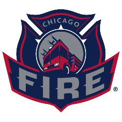
Chicago Fire FC Alternate Logo
The Chicago fire fc logo history is filled with unique secondary emblems that represent the city's spirit. For instance, in 2006, the club launched the "Chicago Fire Red" campaign to celebrate its tenth anniversary. This Chicago Fire FC alternate logo featured a red fire-breathing dragon on a navy background. This design was meant to represent power, strength, and courage. To see how these designs align with the club's milestones, visit the Fire FC team history page.
Furthermore, the Chicago fire fc logo history includes a memorable 2017 playoff version. This Chicago Fire FC alternate logo featured an orange lion head surrounded by four stars and flames. Consequently, many fans searching for a Chicago fire fc logo PNG look for this specific symbol of victory. While these graphics are bold, the Chicago Fire FC wordmark logo provides a more traditional typographic look. Therefore, the Chicago Fire FC alternate logo adds necessary depth to the brand.
In short, the Chicago fire fc logo history reflects a journey of hard work and determination. Today, the Chicago Fire FC alternate logo is a favorite among collectors and designers alike. Because the club values its heritage, the Chicago fire fc logo PNG files remain high-quality representations of the team's evolution. In conclusion, these diverse symbols prove that the Chicago fire fc logo history is about more than just a primary shield; it is about the passion of the fans.


