New England Revolution
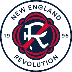
A stylized letter “R”, invoking the club’s name, in a style reminiscent of the Revolutionary War era. A red strikethrough of the letter “R” roots the club’s identity in the defiant and patriotic spirit of the American Revolution. The seal is bordered by a design emblematic of traditional flag drapery with details embodying patriotic bunting. To form the official crest, a wordmark “NEW ENGLAND REVOLUTION” in the blue and inaugural season – 1996 – are inscribed in a circle with a navy blue border.
Revolution Wordmark Logo
The New England Revolution is an American professional soccer club based in the Greater Boston area. Established in 1995, they are one of the founding clubs of Major League Soccer and have been a member since its inception. The team has seen much success over its 25-year history, including four MLS Cup appearances and five U.S Open Cup Championships. As such, it’s no surprise that the Revolution has had several logos throughout their time as a club to reflect this success and also capture what makes them unique from other teams around America’s top division league - namely being located in New England!
The first logo for the Revolution was released when they were established back in 1995; it featured a white shield with red trim on either side along with two stars at its center to represent Massachusetts' status as one of 13 original colonies during America's Revolutionary War period (hence why "Revolution" was chosen as part of their name). This design remained until 2002 when it underwent minor changes such as adding black outlines around each star while keeping all other elements intact - which lasted until 2009 before another redesign took place later that year featuring more modernized graphics like blue accents instead of red ones plus additional lines within both sides making up for an overall cleaner look than before!
In 2013 however came yet another change: now featuring three stars inside its shield-like shape representing not only Massachusetts but also Rhode Island & Connecticut (the two states next door) while still maintaining some traditional aspects like having a navy blue outline & white background colors present so people could recognize who exactly this belonged too even if just glancing quickly at any given moment; additionally, there were small tweaks made every few years afterward ultimately leading us up till today where we currently stand right now – same basic concept but slightly altered details here&there giving us our current primary logo which looks great no matter how many times you see or hear about “New England Revolutions wordmark Logo History."

New England Revolution
1996 - Present
Wordmark "NEW ENGLAND" and in a custom font (paintbrush) "REVOLUTION" in blue.
Font: Sans-serif
https://www.fontsquirrel.com/fonts/list/classification/serif

New England Revolution
1996 - Present
Wordmark in a custom font (paintbrush) "REVOLUTION" in blue.
Font: Sans-serif
https://www.fontsquirrel.com/fonts/list/classification/serif
Soccer Sports Fan Products


