
Seattle Sounders FC
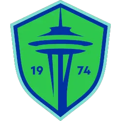
The Space Needle is blue inside a Rave Green shield with two blue trims. The club’s founding was in 1974 on both sides of the Space Needle.

Seattle Sounders FC
2024 - Present
A black and white orca kicking a black and white soccer ball with its fin.

Seattle Sounders FC
2024 - Present
A carnation flower in aqua and black with 1974 split between the carnation.
The players handout a carnation to all the fans in attendance of the last game of the year.

Seattle Sounders FC
2024 - Present
The number "74" in black.
The year the Sounders were formed.

Seattle Sounders FC
2009 - 2024
A green, blue and white shield with a black Space Needle centered with initials on both sides of the needle. The initials are "SS" and "FC" in white.

Seattle Sounders FC
1974 - 1978
The Seattle Space Needle is in blue next to a blue, dark blue, and white soccer ball with waves below next to a wordmark "SEATTLE SOUNDERS" in blue.

"Every Club Has a Story. Every Kit Tells It"
From the original '96 franchises to the newest expansion stars, MLS history is written in the colors of the community. Rep your club’s journey and wear the crest that defines your city’s legacy on the pitch.
Shop the Official MLS Collection






Seattle Sounders FC Alternate Logo
The Seattle Sounders FC logo history is famous for its connection to the city's iconic skyline. Consequently, the Seattle Sounders FC alternate logo often isolates the Space Needle symbol to highlight the club's "Sounder Blue" and "Rave Green" colors. These designs reflect the deep water of the Puget Sound and the lush forests of the region. You can find more specific branding details on the Sounders team history page.
Furthermore, the Seattle Sounders FC logo history reached a massive milestone with the 2024 brand evolution. Many fans searching for a Seattle Sounders FC logo PNG appreciate the new minimalist orca mark, which honors the club's 1970s heritage. While the primary shield is the main face, the Seattle Sounders FC wordmark logo provides a clean typographic alternative for apparel. These elements perfectly capture the "Eternal Blue, Forever Green" spirit.
In short, the Seattle Sounders FC logo history reflects a journey of professional dominance and community unity. Every Seattle Sounders FC alternate logo used in marketing reinforces the club's identity as a leader in North American soccer. Consequently, the high-quality Seattle Sounders FC logo PNG remains a top asset for supporters. Therefore, this visual identity continues to inspire the "Emerald City Supporters" and fans across the globe with its authentic charm.