Tampa Bay Mutiny
2000 - 2001
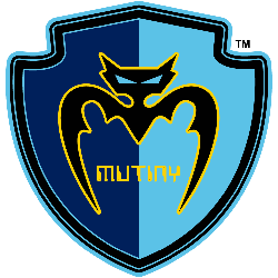
A black bat trimmed in gold inside a double-blue shield with a wordmark "MUTINY" in gold, shade of light blue altered for 2000 season.
Tampa Bay Mutiny
1996 - 2001
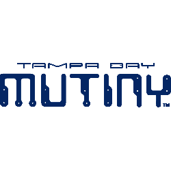
Wordmark "TAMPA BAY MUTINY" in digital type face in the color blue.
Font: Custom
Mutiny Wordmark Logo
The Tampa Bay Mutiny was a professional soccer team that played in Major League Soccer (MLS) from 1996 to 2001. The team had an iconic logo and wordmark that represented the spirit of the city and its fans. Throughout its five-year history, the Tampa Bay Mutiny's logo underwent several changes, each one adding more meaning to it than before.
The original logo featured a shield with four stars, representing Florida’s four major cities: St Petersburg, Clearwater Beach, Sarasota, and Bradenton. Inside this shield was an image of three lightning bolts which symbolized energy and power – qualities associated with both soccer teams as well as those living in Florida’s sunshine state climate! Below this design were two crossed swords which served as another reminder of strength for fans cheering on their favorite MLS club at Raymond James Stadium or watching them on television during away games throughout North America.
In 1998 when new ownership took over they decided to update the look by changing some elements within their existing identity system; specifically updating their wordmark into something more modern looking yet still keeping true to what made it so recognizable among supporters worldwide - incorporating “Tampa Bay" above "Mutiny". This allowed for better brand recognition while also giving them greater flexibility when designing promotional materials such as jerseys or tickets etc. With these subtle refinements taking place over time we can see how important logos are not only just visually but also culturally within sports franchises like The Tampa bay Mutiny who have left behind such lasting impressions through years gone by!
Soccer Sports Fan Products


