St. Louis City SC
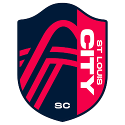
The original primary crest for St Louis City SC is a red and blue shield which incorporates the famous Gateway Arch as well as two additional lines representing the Mississippi River and Missouri River. The team name flipped onto its side and written to the right. This crest was designed by a group of 20 local artists and was released in the Summer of 2020.
St. Louis City SC
2023 - Present
The original primary crest for St Louis City SC is a red and blue shield which incorporates the famous Gateway Arch as well as two additional lines representing the Mississippi River and Missouri River. The team name flipped onto its side and written to the right. This crest was designed by a group of 20 local artists and was released in the Summer of 2020.
St. Louis City SC Primary Logo
The St. Louis City SC primary logo has a short but impactful St. Louis City SC logo history that began with the city’s rich heritage. Initially, the design process drew inspiration from the iconic Gateway Arch and the confluence of the Missouri and Mississippi Rivers. Furthermore, the St. Louis City SC primary logo features a bold pink-red color known as "City Red." You can read more about the club's initial launch and growth on the team history page.
Additionally, the St. Louis City SC logo history highlights deep local connections within the shield. For instance, the horizontal lines represent the rivers that meet in the region. Many fans looking for a St. Louis City SC logo PNG notice the abstract Arch shape which anchors the design. While this shield is the main identity, the St. Louis City SC wordmark logo offers a different look for supporters to enjoy during match days.
In short, the St. Louis City SC primary logo successfully connects the city to the global soccer community. Throughout the St. Louis City SC logo history, the club has used visual cues like the fleur-de-lis to honor its French roots. Consequently, the St. Louis City SC logo PNG is a symbol of strength and resilience for the "Show Me State." Therefore, the St. Louis City SC primary logo stands as a modern masterpiece that reflects the passion shared between the players and the diverse fans.
College Sports Fan Products


St. Louis City SC Fans Time to Vote
Get ready for the MLS Team Logo Battle as the St. Louis City SC logo takes on rival team crests. The St. Louis City SC primary logo features a bold shield design inspired by the iconic Gateway Arch and flowing lines that reflect the city’s heritage and movement. Its modern style and vibrant colors represent ambition, unity, and competitive strength.
More than a visual identity, the St. Louis City SC logo stands as a symbol of pride, resilience, and deep community roots. Fans proudly rally behind this distinctive crest as it competes in the ultimate team logo battle. With its strong symbolism and clean design, the St. Louis City SC emblem captures the passion and determination that define the club and its loyal supporters.
Click to go to MLS Logo Battle and vote


