LA Galaxy
A blue with light blue and yellow border shield, initials “LA” in white and a wordmark “GALAXY” in blue on a yellow banner. A quasar star is at the top of the crest.
Galaxy Alternate Logo
Over time, as soccer became more popular in America and around the world, so did LA Galaxy's logos evolve to reflect these changes and meet fan demand for something new and exciting every season or two. In 2008 they introduced their second alternate logo which still featured elements from their original crest but had been modernized with bright colors like yellow gold on a navy blue background along with white stars surrounding it all—representing both Los Angeles' past accomplishments as well as its future potential within Major League Soccer (MLS).
In 2017 another update was made to give fans something even fresher than before: A brand new badge featuring three lines running horizontally across it symbolizing the unity between players/fans/city while also emphasizing strength through diversity—a perfect representation for such an iconic club located right here in Southern California! Additionally, there are now two versions available - one featuring traditional coloring while the other has been given vibrant rainbow hues making sure everyone can show off their love no matter what style preference they have!
LA Galaxy
1996 - 2007
Orange, teal, white, black and yellow solar rings around a moving galaxy with eyes.

LA Galaxy
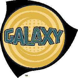
1996 - 2007
Wordmark "GALAXY" in teal with black trim inside yellow circle with a black abstract formed galaxy.
