D.C. United
2016 - Present
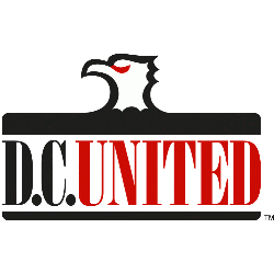
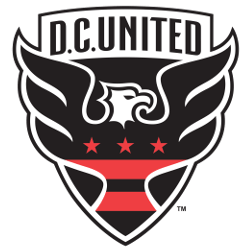
A black, white and red shield-looking emblem that features a D.C. flag-inspired design across the black, white and red eagle with more dynamic wings and a wordmark “D.C. UNITED” in black.
DC United Alternate Logo
D.C. United is a professional soccer team based in Washington, D.C., and they have had several alternate logos throughout its history since the team’s founding in 1996, particularly in relation to the Columbus Crew SC Wordmark logo. The first alternate logo was introduced when the club joined Major League Soccer (MLS) as an expansion franchise, featuring two stars above a shield with “DCU” written across it and three stripes on either side of the shield representing each of its home states: Maryland, Virginia, and Washington D.C. This logo has been used for various merchandise items over time but has not been featured prominently on any jerseys or other apparel worn by players during matches until recently when it was used to commemorate their 25th anniversary season in the 2020-2021 season.
In 2009, another alternate logo was unveiled which features an eagle perched atop a black circle with four red stars around it representing each of DC United's MLS Cup Championships won between 1996-2004 as well as two US Open Cups titles won during that same period; this design also includes “DCU” written across the top portion of the circle while underneath reads “Established 96" - referencing both years established (1996). This version is still being utilized today for branding purposes including signage at Audi Field stadium where DC United play their home games currently
The most recent addition to DC United's alternative logos came about just last year ahead of the 2019 MLS All-Star Game held at Audi Field Stadium; this one features three white arrows arranged inside a blue triangle pointing upwards towards skyward symbolizing unity amongst fans & supporters along with words "United We Rise" printed beneath them - all set against background gradient color scheme ranging from light blue near bottom-up through dark navy hue near top portion reflecting colors found within main crest itself too! It serves as a reminder that no matter how tough times may be we can always come together and overcome adversity together if the united spirit remains strong enough!
D.C. United
1998 - 2015
A black, white and red eagle's head above a wordmark "D.C." in black and "UNITED" in red with a black underscore.
