Seattle Storm
The new design retains the iconic image of the Space Needle, which sits within basketball ribs and adds inspiration from Mount Rainier for its shape. At the center, a lightning bolt evokes the intensity, power, and purpose of the Storm identity both on and off the court. The typeface of the wordmark “SEATTLE STORM” on the new logo features a thinner custom font.
Storm Alternate Logo
The Seattle Storm have been a part of the WNBA since 2000, and throughout their 20 years in the league, they’ve had several alternate logos to go along with their primary logo. The Storm’s first alternate logo was unveiled in 2004 when the team incorporated an image of Mount Rainier into its design. This is still one of the most popular designs among fans today.
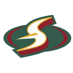
In 2008, a new alternate logo was introduced featuring two lightning bolts that form an “S” for Seattle as well as a basketball inside it. This design has become synonymous with the team and is often seen on merchandise and apparel items related to them.
The following year saw yet another redesign; this time featuring two hands coming together around a basketball which symbolizes unity within both players and fans alike who support them through thick or thin times during any season or playoff run they make each year respectively.. In 2013, another update came out showcasing what appears to be clouds above Mount Rainier while also having stars scattered across it representing all those involved with making up who are now known as “the 12th Man" – referring back again towards fan loyalty amongst other things associated strongly tied directly towards Seattle's professional sports teams from baseball (Mariners) football (Seahawks) & even hockey (Thunderbirds).
As recently 2018-2019 seasons concluded though before 2021 began anew we were graced by yet one more iteration - this time paying homage not only to our beloved mountain but also incorporating elements such as water droplets cascading down off its peak which serves double duty purposefully connecting us back full circle directly once more towards our city itself is surrounded by Puget Sound waters!
All these different variations over the past couple of decades have kept things fresh & exciting for the loyal fanbase here locally thus allowing us all to enjoy a visual representation of what makes it unique about living right here heartland Pacific Northwest regionally speaking too!
Seattle Storm
2021 - Present
The new design retains the iconic image of the Space Needle, which sits within basketball ribs and adds inspiration from Mount Rainier for its shape. At the center, a lightning bolt evokes the intensity, power, and purpose of the Storm identity both on and off the court.
Seattle Storm
2016 - 2020
White, yellow and green letter "S" on green and white oval background.
Seattle Storm
2000 - 2015
White, orange and red letter "S" on green and red oval background.
