Seattle Storm
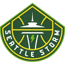
The new design retains the iconic image of the Space Needle, which sits within basketball ribs and adds inspiration from Mount Rainier for its shape. At the center, a lightning bolt evokes the intensity, power, and purpose of the Storm identity both on and off the court. The typeface of the wordmark “SEATTLE STORM” on the new logo features a thinner custom font.
Storm Wordmark Logo
The Seattle Storm have been a force in the WNBA since their inaugural season in 2000. As such, they have an iconic logo that has evolved over time to reflect the team’s history and success. The current iteration of the logo features a bold storm cloud with lightning bolts radiating outward from its center, encircled by “Seattle Storm” written in white block lettering. This design is simple yet effective, and it perfectly captures what makes this team so great: strength through adversity.
The original version of the Seattle Storm wordmark was introduced when they first joined the league back in 2000 and featured a more traditional font style than we see today as well as two basketballs on either side of “Storm” which were meant to symbolize teamwork and unity amongst players on the court (the balls were later removed). In 2004, however, things changed drastically when Nike became involved with rebranding not only sports teams but also entire cities under their own identity system called "Brand Jordan". For this reason alone it's no surprise that many elements from Michael Jordan's Chicago Bulls jersey found themselves integrated into this new branding system - including for our beloved Seattle Storm!
The most notable change was replacing those two basketballs with five stars representing each member of MJ's championship-winning squad; these stars remain part of today's look even after being slightly modified during another redesign process done by Adidas Creative Services back in 2012 where everything else about our beloved 'S' got updated too (including colors & shapes) making up what we all know now as one powerful mark standing out among other WNBA logos around!
Overall there seems to be much thought put behind every detail seen within both past & present versions alike - something fans can appreciate especially considering how far along these designs are taken before finally seeing them come alive at courtside or across merchandise lines everywhere you go! It just goes without saying that whether you're cheering for your favorite player(s) or proudly wearing some gear showcasing your loyalty towards Team Green...there will always be plenty of reasons why everyone should take notice whenever someone speaks about 'that awesome-looking S.'

Seattle Storm
2021 - Present
Wordmark "SEATTLE STORM" stacked in green.
Font: Custom
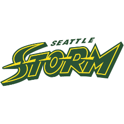
Seattle Storm
2016 - 2020
Custom font wordmark "STROM" in green with yellow trim and streaks and "SEATTLE" in green on top.
Font: Custom
Seattle Storm
2000 - 2015
Custom font wordmark "STROM" in white on a green background.
Font: Custom


