Seattle Storm
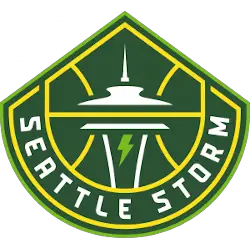
The new design retains the iconic image of the Space Needle, which sits within basketball ribs and adds inspiration from Mount Rainier for its shape. At the center, a lightning bolt evokes the intensity, power, and purpose of the Storm identity both on and off the court. The typeface of the wordmark “SEATTLE STORM” on the new logo features a thinner custom font.
Storm Primary Logo
The Seattle Storm is one of the most successful and iconic teams in the Women’s National Basketball Association (WNBA). As part of their legacy, they have a long and storied history with their primary logo. The Storm’s original logo was unveiled in 2000 when the team joined the WNBA as an expansion franchise. It featured a basketball set against a blue background with white stars surrounding it, along with “Seattle Storm” written above it in white lettering.
In 2003, following two seasons featuring this original design, Seattle underwent its first major redesign to coincide with new ownership taking over the team from NBA owners Howard Schultz and Barry Ackerley. This new version featured an updated color scheme—green instead of blue—and replaced “Seattle Storm” at the top left corner with just “Storm." The basketball itself also changed slightly; now featuring more defined lines around its edges rather than being completely round like before.
In 2007 another update was made to give even more definition to both sides of the ball while keeping the same overall look from the previous iteration intact: the green background remained unchanged but stars were removed completely leaving only text remaining on either side reading "STORM" at the top left corner & bottom right respectively. Additionally, small lightning bolts appeared underneath each letter which added extra flair that wasn't present before giving us what we know today as the current official primary logo used by organizations since then up until the present day!
Overall these changes reflect how much growth has occurred within the organization since its inception back in 2000 when they were still a relatively unknown entity compared to other established franchises already playing leagues such as Los Angeles Sparks or Phoenix Mercury who had been around longer than them - yet despite all odds managed to become one most recognizable teams not only WNBA but professional sports worldwide thanks largely due success seen throughout years under various ownerships/coaches etc... Today's modernized take on classic look serves reminder those humble beginnings where anything seemed possible no matter situation may be!

Seattle Storm
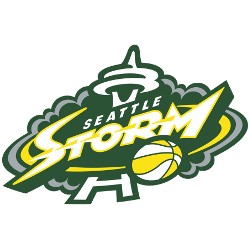
2016 - 2021
The Seattle Space Needle in the center and green and silver storm clouds with wordmark "SEATTLE" in white and STORM" in white with yellow and green trim. WNBA basketball in the lower corner.

Seattle Storm
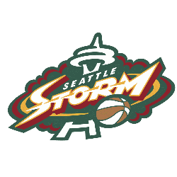
2000 - 2016
The Seattle Space Needle in the center and green and red storm clouds with wordmark "SEATTLE" in white and STORM" in white with red trim. WNBA basketball in the lower corner.
College Sports Fan Products
The WNBA League Teams Logo Battle is an exciting way for Seattle Storm Sports Fans to show their pride and support for their favorite team! With the help of fans worldwide, teams have been competing in a head-to-head logo battle. This competition has given diehard fans a chance to make sure their favorite team's logo stands out. Show your spirit and vote now so your beloved Seattle Storm can come out on top!


