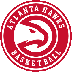
Atlanta Hawks
A minor update to the Atlanta Hawks primary logo for the 2020 - 2021 NBA season, the Hawks updated the font used in the wordmark in the roundel and also removed the word "CLUB" from…
Boston Celtics
The world-famous figure has his left eye winking at you, his left hand resting on his shillelagh, his right index finger is pointing straight upward with a brown basketball sitting atop, his left foot crossed…
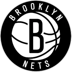
Brooklyn Nets
A black letter "B" on a white basketball with black seams inside a black circle with the wordmark "BROOKLYN NETS" arched around in white.
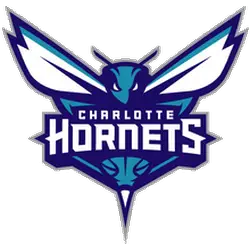
Charlotte Hornets
The new Hornets logo utilizes the purple and teal color palette and features an aggressive looking hornet that is ready to attack. Its piercing eyes, raised antennae, expanded wings and pointed stinger depict its relentless…
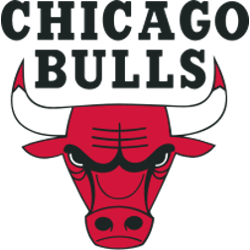
Chicago Bulls
The iconic Bulls' logo is comprises of the face of an angry and fierce red bull whose horns are tipped with blood. A wordmark "CHICAGO BULLS" in black above the bull. The logo was designed…
Cleveland Cavaliers
Continue with the black with gold and maroon shield and wordmark "CLEVELAND CAVALIERS" in gold with a custom letter "C" in maroon with gold highlights. A new shade of gold, replacing mustard as their primary…
Dallas Mavericks
Incorporating a shield with a the head of a stallion, the stallion’s mane sweeps inside a circle giving the appearance of the seam lines found on a basketball. In addition, a wordmark of “Mavericks” at…
Denver Nuggets
Gold pickaxes with a white and gold mountain peak between them, a white and gold basketball below inside a navy blue and red with gold trim roundel. Wordmark "DENVER NUGGETS" in white encircling the logo…
Detroit Pistons
In 2017 the Pistons return to the 80's and 90's logo. Pistons changed the basketball to a solid red with white outline. The wordmark “DETROIT PISTONS” in white and in the center of the basketball.…
Golden State Warriors
Bay Bridge in blue on a yellow circle with wordmark "GOLDEN STATE WARRIORS" surrounding it, font and bridge updated for 2019-20 season.
Houston Rockets
A red letter "R" shaped like a rocket ship blasting off on a black and graphite basketball planet with a wordmark ""HOUSTON ROCKETS" in white ringed around it.
Indiana Pacers
A basketball streaking into the letter "P," placed inside a gold roundel with the team name arched around it in blue. Darkened the shade of blue and yellow.
Los Angeles Clippers
A navy blue ship acting as a nautical rose with a letter "C" behind it on a white background with an encircled wordmark "LOS ANGELES CLIPPERS" in white on a blue with red trim background.
Los Angeles Lakers
A gold with purple outline basketball with a wordmark "LAKERS" across the front in purple with speed lines on a white formed background. A darkened shade of purple.
Memphis Grizzlies
Slight adjustments made to previous Grizzlies' primary logo, which include removal of lightest of their three blues at the snout, addition of grey outline, and new wordmark font "MEMPHIS" and "GRIZZLIES" in blue.
Miami Heat
In 1999, Miami Heat logo went through a minor changes, the structure and shape remain unchanged, but the color of the fiery basketball has changed to red below the rim and orange above the rim…
Milwaukee Bucks
The new Buck is only looking ahead, an imposing figure determined and focused on the path in front of him. An expanded rack (from 8 to 12 points) showing the maturation of the Buck, and…
Minnesota Timberwolves
The logo has many nods to Minnesota, the team and, of course, the Timberwolf. There’s the North Star which represents one of the pillars Minnesota hangs its hat on. The star represents Minnesota pride. The…
New Orleans Pelicans
A front-facing pelican bird with white, navy blue, and gold wings, a red beak, and a gold and white basketball in front of it is above a double-stacked wordmark "NEW ORLEANS PELICANS" in navy blue.
New York Knicks
A wordmark "KNICKS" in orange arched over an orange with blue trim basketball placed on a silver with blue trim triangle and "NEW YORK" arched above in blue. Slightly tweaked the color of the orange…
Oklahoma City Thunder
The Oklahoma City Thunder unveiled their first logo on September 3, 2008. The logo is a large blue and yellow banner with the logo in the middle with the wordmark "OKC," and splashes of yellow…
Orlando Magic
A basketball in blue with white highlights and several stars in white with blue and black trim trailing behind it.
Philadelphia 76ers
The team’s new primary logo is a modern interpretation of the classic Sixers insignia, stylistically redeveloped to include a patriotic blue border with six white stars and “PHILADELPHIA” adorned across the heading. The familiar white…
Phoenix Suns
A basketball sunburst over the stacked wordmark “PHOENIX SUNS" with a new font. The new logo features a black backdrop and a simplified basketball similar to the one used by the team from 1993 -…
Portland Trailblazers
The main change is the swap of the colors in the pinwheel, with red moving up top, and white - instead of silver - going to the bottom. There's also a slight design change in…
Sacramento Kings
The new primary logo closely resembles the team's original logo created back when the franchise moved from Kansas City to Sacramento in 1985. A wordmark "KINGS" in purple in between a purple crown and a…
San Antonio Spurs
Double arched wordmark "SAN ANTONIO" on top and "SPURS" on the bottom in black. The letter "U" is the alternate logo of a spur.
Toronto Raptors
The Toronto Raptors made some color changes to their primary logo. Silver was eliminated completely from the color scheme and the basketball was re-colored red. New to this logo is an outside thick white border.…
Washington Wizards
The new primary logo incorporates the “monument ball” design that has been in place since 2011 in combination with the iconic striping from the team’s uniforms, the three stars that represent D.C., Maryland and Virginia…
All Primary NBA Logos by Team
You’ll find each team’s primary logo listed here—starting from their first official design to the latest update. Whether it's the iconic Bulls logo or a recent change like the Nets, this archive covers it all. You can also visit our NBA Wordmark Logo page for team wordmarks used alongside these symbols.
For in-depth information on logo transitions, NBA’s official brand resources offer details on design choices and guidelines. It’s a helpful external reference if you’re researching the NBA logo history or interested in official league branding.

