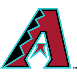
Arizona Diamondbacks
A Sedona Red letter "A" with black and Sonoran Teal diamondback patterning, and the middle of the letter "A" is cut to resemble a snake head; a red and teal half star is present in there, which also serves as both the tongue of a snake and the negative space in between the eyes.
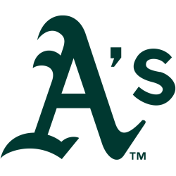
Athletics
A green letter "A" with an apostrophe "S" that had been used when they played in Oakland for multiple decades. This version of the A was first adopted in 1993, following slight tweaks to logos used as far back as 1902.
Atlanta Braves
A red tomahawk with gold and blue details below wordmark "Braves" scripted in blue and red. The Braves darkened the shade of blue and gold on this logo prior to the 2018 season.
Baltimore Orioles
Smiling black and orange cartoonish oriole wearing a baseball cap sporting the Orioles alternate cap logo. Moved from alternate to primary in 2019.
Boston Red Sox
The Boston Red Sox logo comprises of a pair of hanging socks visually representing the team’s name, which derives from the ancient plural form of the word “socks”. All wordmark have been removed.
Chicago Cubs
The giant "C" has become rounder inside the blue circle and more geometric while the outlines are thicker. The giant "C" has the "UBS" added inside the "C." The blue circle has now become much thicker and bold.
Chicago White Sox
The current White Sox logo has become an old English wordmark "SOX" in black and white with a silver trim. The script is in a diagonal position.

Cincinnati Reds
The current Reds logo is a simple white wishbone letter “C” with the wordmark “REDS” inside the letter “C” in white. A black trim is added to give the letter “C” and the wordmark “REDS” to give the logo a 3-D look. A slightly different shade of red.
Cleveland Guardians
A letter "G" in red with blue trim and shadowing placed on either side of a white, red and blue baseball, the letters placed to resemble a split-finger fastball grip. A set of blue and white wings are on the back of the letters as a nod to the Guardians of Traffic statues outside the stadium.

Colorado Rockies
A classic letter linked “CR” in silver with a thick black trim. The letter “CR” represent the state and nickname Colorado Rockies.

Detroit Tigers
Olde English style letter "D" in navy blue. A new style of olde english lettering.
Houston Astros
The current logo is a slightly beveled white “H” that is on top the orange star on a blue circle with two orange rings and a wordmark "HOUSTON" and "ASTROS" on top and bottom of the "H" and star.
Kansas City Royals
An connected initials "KC" in white placed on a blue royal banner (which also happens to be in the shape of a home plate) with a gold crown above it. Changed their shade of blue and gold.

Los Angeles Angels
A two-toned letter "A" trimmed in blue with a silver halo. A new logo due to changes of dropping "of Anaheim" prior to the 2016 season.
Los Angeles Dodgers
The 2012 updated logo, the most obvious change is the thicker line weight on the ball and streaks. There are also multiple edits incorporated into the wordmark. First off, the "O" no longer has a tail on the left side. In fact, the loss of the "O"’s tail allows for a cleaner presentation and allows the viewer to get directly into the word, instead of starting with the superfluous tail. The "E" has also been adjusted to appear that the line coming off the "G" flows smoothly into the stroke of the "E". The old mark featured a disjointed connection between the two letterforms. Lastly, the wordmark’s tail was edited so it terminates with an inverted rounding line instead of a flat line, which more closely mirrors the wordmark from the team’s jerseys.
Miami Marlins
A blue, red, and black marlin leaping next to a baseball and wordmark "Miami" in black with blue and red trim.
Milwaukee Brewers
An "M" and a "B" in the shape of a baseball glove in navy, royal blue, and yellow inside a circle with wordmark "MILWAUKEE BREWERS" in white written around it.
Minnesota Twins
A navy blue letter "T" interlocking with a red letter "C," the two letters stand for Twin-Cities, the nickname for Minneapolis and St. Paul. This logo is an updated to the original initials "TC" logo used by the Twins from 1961 through 2022; the serifs at the end of the letter "T" have changed, the letter "C" is much smaller, and the shade of blue has been darkened.
New York Mets
A scripted wordmark, "Mets" trimmed in white, was placed upon a blue skyline of New York. The buildings on the Mets logo are a generic church spire, the Williamsburgh Savings Bank, the Woolworth Building, the Empire State Building, and the United Nations. A white bridge and the orange stitches of a baseball are placed in front of the skyline. The initials "NY" insignia on the left side was removed.
New York Yankees
The Yankees logo design highlighted with a red bat which extends to become the vertical line of the "K" of the red wordmark “Yankees." Also the logo consists of an Uncle Sam top hat that is red, white and blue in color and hangs on the baseball bat on top of a white baseball with red seams. The powder blue under brim of the hat was removed from the previous logo.

Philadelphia Phillies
Wordmark "Phillies" scripted in red on a blue Liberty Bell. Simplified version of previous logo, diamond removed, blue darkened, underline removed, and bell tweaked slightly.

Pittsburgh Pirates
The Pirates chose to use a old english letter "P" in yellow, going back to the old style of logo from the early 1900's. The letter "P" stands for either the city Pittsburgh or the nickname Pirates.
San Diego Padres
For the 2020 season, the Padres unveiled a new color for their primary logo, featuring the interlocked initials “SD” in brown.

San Francisco Giants
In 2000, the Giants logo had again very minor changes, the white baseball has some cream tinting to give it a 3-D effect. Also, a wordmark of black with orange outline "GIANTS."

Seattle Mariners
The Seattle Mariners new logo design comprises of an 8-pointed compass that rests on a baseball. A wordmark "SEATTLE MARINERS" encircled in a northwest green ring with metallic silver, then white and then metallic silver outline. This logo was designed by the Mariners and Major League Baseball.
St. Louis Cardinals
In 1998, the "birds on the bat" was updated for the first time in 30 years with more detailed bird and bolder letters. The new single red with navy blue outline cardinal has a yellow beak with white eyes. The scripted wordmark "Cardinals" in red with a navy blue trim is a much bolder lettering, continuing with the letter "C" locked up over the baseball bat.
Tampa Bay Rays
Wordmark "RAYS" in navy blue with a light blue drop shadow and a glint of sun ray in gold.
Texas Rangers
A letter "T" in red with a transparent outline and a royal blue drop shadow.
Toronto Blue Jays
Blue jay head in two shades of blue (royal and navy) with a large red maple leaf on the right side. Former alternate logo.
Washington Nationals
The new current Washington logo is a red curly "W" with a blue outline in the middle of a white background and inside a blue circle with red outlines, two red stars, and a wordmark "WASHINGTON NATIONALS" in white.
Diversity in every MLB logo - Primary Logos Collection
"Step Up to the Plate in Style!"
Don't get caught looking—score the latest 2026 City Connect jerseys, authentic on-field caps, and limited-edition vintage threads. Officially licensed gear for every true fan of the game.
Hit a Home Run – Shop MLB Official Gear