
Houston Comets
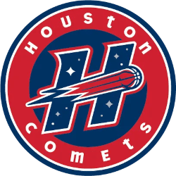
The new Houston Comets logo is a circular roundel. A thick red outer ring carries “HOUSTON” across the top and “COMETS” around the bottom in white, playful block lettering. In the navy center, a bold italic “H” with a white outline is filled with small white stars, like a night sky. A red basketball streaks through the “H” as a comet, trailing white and light-blue speed lines that cut across the letter, giving the badge a sense of motion. The red, white and navy palette ties it to the franchise’s original look. The old primary logo, used from 1997 to 2008, was a red basketball forming a comet that shot over a “Comets” script on a starfield. It had no enclosing shape and was built around the script wordmark. The new logo keeps the core idea of a basketball comet and a starry sky, but changes the structure. The wordmark moves into a circular badge with “HOUSTON” and “COMETS” in block letters around the ring, and the centerpiece becomes a large star-filled “H.” The original alternate logo also had a basketball comet shooting through an “H” with starfields. So the new design effectively takes the old alternate mark as its core, wraps it in a modern roundel, and makes it the primary logo for the team’s return to Houston in 2027.

Houston Comets
2027 - Present
The new Houston Comets alternate logo is a standalone, bold italic “H” in navy blue, edged with a thin white inner outline and a thick red outer border. The letter is filled with small white stars and dots, like a night sky. A red basketball, its seam lines visible, rockets through the middle of the “H” as a comet, trailing streaks of red and white that end in a sharp, lightning-like flash on the left. The flat design and strong outlines make it work well as a compact mark for jerseys, merchandise and social media.
The Comets’ original alternate logo, used from 1997 to 2008, was built on the same concept: a basketball comet shooting through an “H” with starfields. The new version keeps that idea but redraws it in a cleaner, more modern style. The “H” is heavier and more slanted for a sense of speed, the layered red and white outline makes it stand out on any background, and the comet’s tail is sharper and more stylized. The result is a faithful update of the classic mark rather than a new concept, tying the 2027 team directly to the four-time champion Comets of 1997–2000.

Houston Comets
1997 - 2008
A red basketball comet shooting through a letter "H" and blue star-field.

"The Torch Has Been Passed. The Legacy Continues"
From the pioneers who started it all to the generational talents of today, the WNBA is making history every night. Represent the movement and wear the colors of the women who are changing the game forever.
Shop the Official WNBA Collection






Houston Comets Logo WNBA
In red and silver, the 2000 alternate Houston Comets logo, a bold “Comets” wordmark, amplified Houston Comets WNBA energy. For instance, it defined the Houston Comets 4-peat during championship runs. Additionally, its comet streak echoed Houston’s dynasty vibe. Check the Houston Comets Primary Logo for more flair. Therefore, this logo captures the team’s legendary Houston Comets championships.