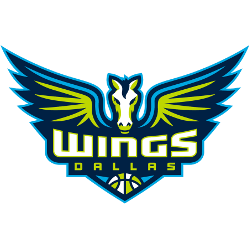
Dallas Wings
Winged horse in navy, volt green and cyan and a wordmark “WINGS” in white with volt green trim and “DALLAS” in volt green with a WNBA basketball.

Tulsa Shock
2010 - 2015
A red and white basketball and wordmark "TULSA" in yellow and "SHOCK" in white with yellow highlights surround by yellow and red outline with lightning bolts.

Detroit Shock
2003 - 2009
A red and white WNBA basketball with wordmark "DETROIT" in white and "SHOCK" in white with silver trim surrounded by blue with red trim outline with lightning bolts all around.

Detroit Shock
1997 - 2003
A red and white WNBA basketball with wordmark "DETROIT" in white and "SHOCK" in white with green trim surrounded by gold outline with lightning bolts all around.
WNBA Dallas Wings Logo
The Dallas Wings logo, launched in 2016, features a Pegasus and basketball, tying to Dallas Wings history. For example, it energizes Dallas Wings WNBA games. Moreover, WNBA Paige Bueckers adds flair to its legacy. Visit the Dallas Wings Wikipedia page for team insights. Thus, this logo inspires fans.
With navy blue, lime green, and sky blue, the Dallas Wings logo reflects Dallas Wings WNBA spirit. Since 2016, it fuels every game’s excitement. For instance, WNBA Paige Bueckers embodies its energy. Check the Dallas Wings Alternate Logo for more style. Therefore, this logo captures Dallas’s bold basketball heritage.
College Sports Fan Products
