Dallas Wings
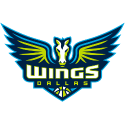
Winged horse in navy, volt green and cyan and a wordmark “WINGS” in white with volt green trim and “DALLAS” in volt green with a WNBA basketball.
Dallas Wings
2016 - Present
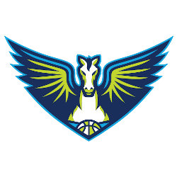
A front view of a winged horse in navy, volt green, and cyan and a WNBA basketball in green and white at the bottom.
WNBA Dallas Wings Logo
The Dallas Wings logo, as a 2016 alternate, features a navy winged horse with a green basketball, boosting Dallas Wings WNBA energy. For example, it inspires games with WNBA Paige Bueckers’ flair. Moreover, it ties to Dallas Wings history from Detroit Shock roots. Visit the Dallas Wings Wikipedia page for details. Thus, this logo rallies fans.
With navy and volt green, the 2019 alternate Dallas Wings logo, a white “WINGS” wordmark, reflects Dallas Wings WNBA spirit. For instance, it shines with WNBA Paige Bueckers in playoff pushes, rooted in Dallas Wings history. Additionally, its bold design pops in games. Check the Dallas Wings Wordmark Logo for more style. Therefore, this logo captures Arlington’s basketball legacy.

