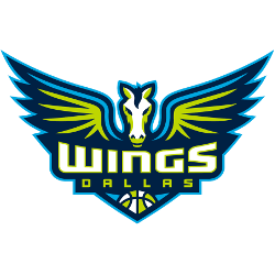
Dallas Wings
Winged horse in navy, volt green and cyan and a wordmark “WINGS” in white with volt green trim and “DALLAS” in volt green with a WNBA basketball.
Wings Wordmark Logo
The Dallas Wings have been a part of the WNBA since 2016, and their logo has evolved over the years. The team’s current wordmark logo features an eagle in flight with wings spread wide and is meant to symbolize strength, power, and freedom.
The original Wings logo was unveiled in 2016 when they joined the league as an expansion team, particularly in relation to the Dallas Wings Primary logo. It featured a white “D” above two red wings that were shaped like feathers on either side of it. This design was meant to represent speed and agility while also paying homage to their home city of Dallas which is known for its vast open skies filled with birds flying high above them every day.
As time went on, the organization felt it could do more justice to its name by creating something that would better capture what being a Wing truly means- courage & bravery through difficult times; soaring higher than before; reaching goals no matter how far away they may seem at first glance! So in 2019, they released an updated version that included a bolder font choice along with some added details such as stars inside each letter & curved lines connecting them together into one cohesive unit - all done so expertly by graphic designer Ryan Smith from San Francisco-based design agency Studio Number One!
The most recent iteration came out earlier this year (2021) where again slight changes were made but this time focusing primarily on refining certain aspects rather than completely overhauling everything: refined edges around letters make up a much smoother overall look while still maintaining the same level detail seen before + new color palette featuring shades blue/green/purple used give off strong sense energy & motion - perfect representation what these athletes embody every game night! All these small tweaks combined create powerful imagery sure help bring fans closer together even when apart physically due COVID pandemic situation currently facing the world today...so go ahead and show your support proudly by wearing the latest iteration of Wings' Wordmark Logo!

Dallas Wings
2016 - Present
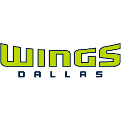
Double lined wordmark "WINGS" in volt green with navy trim and "DALLAS" in navy on the bottom.
Font: Custom