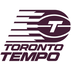
The Toronto Tempo logo, a sleek wordmark, defines the WNBA Toronto team’s identity. Since 2024, its bold text in red and white pops in Toronto Tempo WNBA games. For example, the wordmark, showing “TEMPO,” ties to Serena Williams’ ownership vision. Curious about its design? Check how this Toronto Tempo logo shapes the team’s exciting future!
Toronto Tempo
2026 - Present
The letter “T” is in maroon within a maroon basketball, six charging speed lines are on the left side, and a wordmark is “TORONTO TEMPO” in maroon. The six lines symbolize the five players on the court and the fans while paying homage to Toronto’s nickname, “The Six.”

Toronto Tempo
2026 - Present
A stacked wordmark "TORONTO TEMPO" in maroon.
Font: Custom
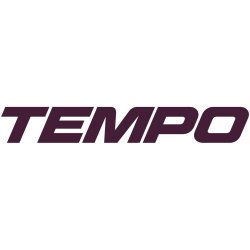
Toronto Tempo
2026 - Present
A wordmark "TEMPO" in maroon.
Font: Custom

Toronto Tempo
2026 - Present
A wordmark "TORONTO" in maroon.
Font: Custom
Wordmark Toronto Tempo Logo
The Toronto Tempo logo, a wordmark since 2024, features “TEMPO” in bold red with white accents. It captures Toronto Tempo WNBA spirit. For instance, it reflects Serena Williams’ investment in the WNBA Toronto team. Moreover, it will shine at Coca-Cola Coliseum. Visit Toronto Tempo Wikipedia. Thus, this wordmark boosts team pride.
The Toronto Tempo logo, a sharp wordmark, evolves with sleek “TORONTO TEMPO” text in red and white. For example, it marks Serena Williams’ role in the 2026 debut. Also, it fuels WNBA Toronto team energy. Check the Toronto Tempo Primary Logo. Consequently, this wordmark enhances Toronto Tempo WNBA legacy.