The Sacramento Monarchs logo, a regal wordmark, shaped the WNBA Sacramento Monarchs’ identity. From 1997 to 2009, its elegant text in purple and silver dazzled in Sacramento Monarchs basketball games. For instance, the wordmark, featuring “MONARCHS,” tied to the Sacramento Monarchs championship in 2005. Curious about its design? Dive into this wordmark’s royal legacy!
Sacramento Monarchs
1997 - 2009
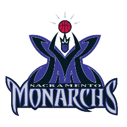
A purple and black letter "M" forming a butterfly queen holding a basketball. Wordmark below "SACRAMENTO" in silver on top and "MONARCHS" in sliver on a black outlined background.

Sacramento Monarchs
1997 - 2009
Double lined wordmark "SACRAMENTO" in black on top and "MONARCHS" in black in a custom font on the bottom.
Font: Custom
Wordmark Sacramento Monarchs Logo
The Sacramento Monarchs logo, a wordmark since 1997, displayed “MONARCHS” in bold purple with silver accents, capturing WNBA Sacramento Monarchs’ pride. For example, it sparkled during the Sacramento Monarchs championship run in 2005, led by Yolanda Griffith at ARCO Arena. Plus, it embodied Sacramento Monarchs basketball’s regal vibe. Visit Sacramento Monarchs Wikipedia for more. Hence, this wordmark defined the team’s triumphant era.
The Sacramento Monarchs logo, a refined wordmark, evolved with sleek “SACRAMENTO MONARCHS” text in silver by 2005. Notably, it shone during the 2006 playoffs, boosting Sacramento Monarchs basketball spirit. It also tied to the Sacramento Monarchs championship legacy. Check the Sacramento Monarchs Primary Logo for details. Thus, this wordmark collection highlighted the WNBA Sacramento Monarchs’ royal history at ARCO Arena.
Basketball Sports Fan Products