Atlanta United FC
A black roundel logo with a bold letter "A" in gold on a black and red background. Wordmark "ATLANTA UNITED FC" encircled in gold.
Austin FC
Twin green oak trees inside a black with green trim shield and wordmark "AUSTIN" above in white.
CF Montréal
The shield, which has long been part of Montreal Impact’s branding; a stylized white fleur-de-lys to represent Quebec; the blue and black stripes worn by the team when it won its first championship; the year…
Charlotte FC
A roundel logo with wordmark "CHARLOTTE FOOTBALL CLUB" in white and "MINTED 2022" in blue on a black background. The white crown represents Queen Charlotte and the four spires for the four wards of the…
Chicago Fire FC
A light-blue Florian cross with a red letter “C” and a Chicago six-pointed star in the center with a black outline. A streamlined version of the club’s original Florian Cross crest.
Colorado Rapids
Red and blue with grey trim badge with a white, red and blue soccer ball, blue, white and grey mountains, and a wordmark "COLORADO RAPIDS" in white. The year 96' in red below the mountains.
Columbus Crew
After revealing a new name and logo within two weeks, the Columbus team has again a new name and logo. Continuing with the same theme, the newly minted name of "Columbus Crew" has added the…
D.C. United
A black, white and red shield-looking emblem that features a D.C. flag-inspired design across the black, white and red eagle with more dynamic wings and a wordmark "D.C. UNITED" in black.
FC Cincinnati
A lion holding a sword and wearing a crown inside a blue and orange with a black trim shield. Diagonal wordmark "CINCINNATI" in black.
FC Dallas
A blue, white and red longhorn on a blue and red with white and red trim shield with Texas flag colors under a wordmark "FC DALLAS" in white. The year "96" in grey below the…
Houston Dynamo FC
An orange design element of the initials "HD," the white wordmark "Houston Dynamo FC" underneath, and an orange lightning graphic at the bottom.
Inter Miami CF
The crest, designed in style and colors that recall the city's Art Deco architectural tradition, displays two great white herons with interlocking legs forming a letter M. Between the herons is an eclipse, the sun…
LA Galaxy
A blue with light blue and yellow border shield, initials "LA" in white and a wordmark "GALAXY" in blue on a yellow banner. A quasar star is at the top of the crest.
Los Angeles FC
A black with a gold trim shield with the initials “LA” with wings coming out of the letter "A" and wordmark "LOS ANGELES" in gold on top and below "FOOTBALL CLUB" in gold.
Minnesota United FC
A blue and grey crest with a black with a red-eye loon, a grey North Star, a blue stripe in the middle of the crest and the initials “MNUFC” in black diagonally at the bottom.
Nashville SC
Blue sound waves on both sides of a blue letter "N" inside a yellow with blue trim octagon and below a wordmark "NASHVILLE SC" in blue.
New England Revolution
A stylized letter “R”, invoking the club’s name, in a style reminiscent of the Revolutionary War era. A red strikethrough of the letter "R" roots the club’s identity in the defiant and patriotic spirit of…
New York City FC
Interlocking initials "NYC" design in white on a blue circle with a powder blue circle and orange trim surrounding. Wordmark "NEW YORK CITY" and "FOOTBALL CLUB" written on powder blue outer circle. Two pentagons (representing…
New York Red Bull
Two red bulls charging a black and white soccer ball with a yellow background on a white with blue trim shield. Two wordmark "Red Bulls" in red on top and "NEW YORK" arched in blue…
Orlando City SC
A purple with a white and purple trim shield with a yellow lions head looking like a sun above a wordmark "ORLANDO CITY" in white.
Philadelphia Union
A blue roundel logo with gold outline and a center with light blue and gold and white trim. In the center, there’s a blue shield with a golden snake and a wordmark “UNION”. Encircle is…
Portland Timbers
A green with an orange trim circle with a superimposed white ax and orange strokes coming from the ax.
Real Salt Lake
Initials "RSL" in gold and red located in the center and around the initials are circles in both red and gold under a gold crown with a gold, white and red soccer ball inside a…
San Diego FC
The club’s official colors were labeled in the explainer as “chrome and azul,” while the crest is said to center around four “principal virtues” that define San Diego: “Gratitude, pride, not loud, diversity and a…
San Jose Earthquakes
A black with white and black trim, with shortened team nickname "QUAKES" in white above city name "San Jose" and establishment year. A soccer ball is shown in between a blue and black pattern. This…
Seattle Sounders FC
The Space Needle is blue inside a Rave Green shield with two blue trims. The club’s founding was in 1974 on both sides of the Space Needle.
Sporting Kansas City
A grey shield with a wordmark "KANSAS CITY" in white at the top of the shield. Below the wordmark is a blue with a white trim mini shield with a wordmark "SPORTING" in white above…
St. Louis City SC
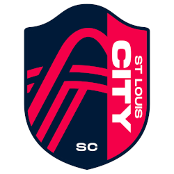
The original primary crest for St Louis City SC is a red and blue shield which incorporates the famous Gateway Arch as well as two additional lines representing the Mississippi River and Missouri River. The…
Toronto FC
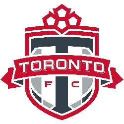
A stylized white and red maple leaf on top of a white and grey shield with a dark grey letter "T" and a red ribbon across it the center with a wordmark "TORONTO" in white.…
Vancouver Whitecaps FC
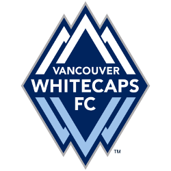
Triple upside-down V's to make whitecap mountains and mirrored triple reverse V's in blue for water whitecaps. Centered is a wordmark "VANCOUVER WHITECAPS FC" in white.
"Every Club Has a Story. Every Kit Tells It"
From the original '96 franchises to the newest expansion stars, MLS history is written in the colors of the community. Rep your club’s journey and wear the crest that defines your city’s legacy on the pitch.
Shop the Official MLS Collection
Evolution of the MLS Primary Logo
When Major League Soccer was founded in 1993, the league introduced its first MLS primary logo ahead of the 1996 season. The design featured a stylized soccer ball with three stars above it. Those stars symbolized club, country, and community. As a result, the early major league soccer logo established a clear foundation for league branding and competitive identity.
In 2007, MLS redesigned the MLS primary logo to modernize its image. The updated major league soccer logo kept the soccer element but introduced a cleaner and more contemporary look. Instead of three stars, the design featured an upward-arching swoosh. Therefore, the new mark symbolized forward movement and league ambition. This update aligned the branding of major league soccer teams with global sports design trends.
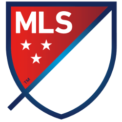
A significant transformation arrived in 2014. At that point, MLS introduced the current shield system. The redesigned MLS primary logo included a diagonal slash and three stars within a bold crest. Moreover, each of the major league soccer teams gained the ability to adapt the logo using club colors. Because of this flexible system, the major league soccer logo achieved both consistency and individuality across the league.
During the 25th season in 2020, MLS celebrated its legacy with a refreshed primary mark inspired by earlier elements in MLS logo history. The commemorative version honored the original identity while maintaining the modern shield structure. Consequently, the MLS primary logo balanced tradition with innovation.
Today, the MLS primary logo stands as a recognizable symbol of unity, growth, and professionalism. As the league continues to expand, the major league soccer logo may evolve again. However, its core purpose remains unchanged: to represent all major league soccer teams under one strong and adaptable visual identity.


