Alternate Logos

Colorado Rapids
Slight colors adjusted from the previous logo. A roundel logo with a soccer ball in the center on a green stared background with a circular wordmark "COLORADO RAPIDS" in gold with white trim on a blue background.

Columbus Crew
This the letter "C" in black pulled out of the primary logo in a custom font with a triangle in the bottom right side of the letter "C."
D.C. United
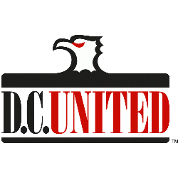
A black, white and red eagle's head above a wordmark "D.C." in black and "UNITED" in red with a black underscore.
FC Cincinnati
Initials "FCC" in orange and blue with a blue crown on top of the last letter "C."
LA Galaxy
Initials "LA" in teal with black trim inside yellow circle with a black abstract formed galaxy.
Los Angeles FC
Initials “LAFC” with wings coming out of the letter "A" in gold with black trim.
Minnesota United FC
Angled wordmark "MINNESOTA" in black and "UNITED FC" in blue and a black with a red-eye loon above to the right.
New England Revolution
A stylized letter “R”, invoking the club’s name, in a style reminiscent of the Revolutionary War era. A red strikethrough of the letter "R" roots the club’s identity in the defiant and patriotic spirit of the American Revolution. The seal is bordered by a design emblematic of traditional flag drapery with details embodying patriotic bunting.
New York City FC
A light blue circle with a triple-lined wordmark "NEW YORK" in blue and "City" in white and "FC" in blue.
Philadelphia Union
A black with gold trim shield with a gold snake on a light blue and black background and a wordmark above "UNION" in gold.
Portland Timbers
A green with a yellow trim circle with a superimposed white ax and yellow strokes coming from the ax. Wordmark "PORTLAND" in white and "TIMBERS" in yellow.
Real Salt Lake
Initials "RSL" in gold and red located in the center and around the initials is circles in both red and gold under a gold crown with a gold, white and red soccer ball inside a blue with red and gold trim shield. A silver star above the shield.
San Diego FC
The heart of our crest is “The Flow,” comprised of 18 lines representing the 18 communities of San Diego County woven into one. The Flow symbolizes how we perform at a peak level while embracing San Diego’s unique rhythm of life. In the center are the initials "SD" in chrome with a colored outline in gold, red, and blue.
San Jose Earthquakes
Wordmark "EARTHQUAKES" in black and "SAN JOSE" in black also "1974" in red above the primary logo.

Seattle Sounders FC
A black and white orca kicking a black and white soccer ball with its fin.

Sporting Kansas City
A grey shield with a wordmark "KANSAS CITY" in white at the top of the shield. Below the wordmark is a blue with white trim mini shield with a wordmark "SPORTING" in white above light blue stripes next to custom font interlocked initials "SC" in white. Below is a wordmark "SPORTING KANSAS CITY" in blue.
Toronto FC
A stylized white and red maple leaf on top of a white and grey shield with a dark grey letter "T."
Soccer Sports Fan Products
The Major League Soccer (MLS) alternate logos have played a significant role in the league's branding and visual identity. Let's take a journey through the history of MLS alternate logos and explore how they have evolved and contributed to the league's image over the years.
In the early years of the MLS, alternate logos were not as prevalent as they are today. The league primarily relied on its primary logo, which featured a stylized soccer ball with three stars representing the league's three pillars: club, country, and community. However, as the league grew in popularity and expanded, the need for alternate logos became apparent.
During the early 2000s, MLS introduced its first set of alternate logos to add variety and flexibility to its branding. These alternate logos often featured variations of the league's primary logo, incorporating different color schemes, simplified designs, or unique graphical elements. These alternate logos allowed teams and the league to create distinct visual identities while still maintaining a cohesive MLS brand.
In the following years, MLS began to embrace more experimentation and creativity with its alternate logos. The league introduced logos that highlighted specific events or initiatives, such as the MLS All-Star Game or the MLS Cup. These logos often incorporated elements related to the host city or the event itself, providing a sense of excitement and exclusivity.
As the league continued to evolve, more teams began to introduce their own alternate logos to further enhance their brand identity. These alternate logos often featured team-specific imagery, local landmarks, or cultural references, allowing fans to connect with their favorite teams on a deeper level. This shift towards team-specific alternate logos helped create a stronger sense of identity and loyalty among fans.
In recent years, MLS has embraced a more minimalist and modern approach to its alternate logos. These logos often feature simplified designs, clean typography, and bold colors, reflecting current design trends. They aim to create a strong visual impact while maintaining the essence of the MLS brand.
The MLS alternate logos have become an integral part of the league's visual identity, providing teams and the league with the flexibility to showcase their unique characteristics and engage with fans in various ways. As the MLS continues to grow and evolve, we can expect to see even more innovative and captivating alternate logos that capture the spirit and excitement of North American soccer.


