The Atlanta Dream logo, a striking wordmark, shapes the Atlanta Dream WNBA identity. Since 2008, its bold wordmark typography in Atlanta Dream colors like red and blue shines in Atlanta Dream games. For example, it displays the team name, tied to Angel McCoughtry’s 2010 Finals run. Curious about this wordmark’s evolution? See how the Atlanta Dream logo fuels the team’s legacy!
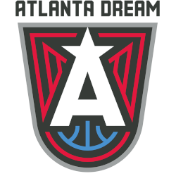
Atlanta Dream
2022 - Present
A large white letter “A” with a star at the top on a dark grey shield with a red phoenix and a blue basketball on it with a wordmark “ATLANTA DREAM” appearing above the shield in black.
Atlanta Dream
2020 - Present
A red with light grey trim wordmark "ATLANTA DREAM."
Font: Unknown
Atlanta Dream
2008 - 2019
Wordmark "DREAM" in light blue with a white star in the letter "A" and "ATLANTA" in red on top.
Font: Unknown
Atlanta Dream
2008 - 2019
Wordmark "ATLANTA" in light blue with red trim and a light blue star on the letter "A."
Font: Unknown
Wordmark Atlanta Dream Logo
Since 2008, the Atlanta Dream logo, a wordmark, showcases “DREAM” in light blue with a white star in the “A.” Also, “ATLANTA” appears in red above. It reflects Atlanta Dream WNBA energy and Atlanta Dream game intensity. For instance, Angel McCoughtry wore it during the 2010 Finals. Seen at Gateway Center Arena, this wordmark highlights Atlanta Dream colors. Thus, it marks the team’s bold start.
In 2017, the Atlanta Dream logo, a sleek wordmark, adopted curved black and blue letters, showcasing Atlanta Dream colors. For example, it stood out in Atlanta Dream games during the 2018 Conference Finals. Moreover, this wordmark reflects team grit. Check the Atlanta Dream Primary Logo for other designs. Consequently, this Atlanta Dream wordmark logo strengthens Atlanta Dream WNBA legacy at Gateway Center Arena.


