Los Angeles Sparks
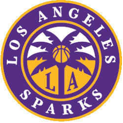
A purple ring with gold trim with encircled wordmark “LOS ANGELES SPARKS” in white. A gold and purple circle with a purple palm tree and a gold basketball in the center. Initials “LA” at the bottom in yellow.
Sparks Primary Logo
The Los Angeles Sparks are one of the most iconic teams in the WNBA, and their primary logo has a long and storied history. The original Sparks logo was designed by graphic artist Bob Moore in 1997 when the team first joined the league. This logo featured an orange basketball with yellow wings that represented both LA’s sunny climate as well as its “City of Angels” nickname.
In 2008, following a decade-long run with this design, it was replaced by another iteration created by designer Joe Bosack & Co., which featured two interlocking circles to represent unity among players and fans alike while also reflecting on LA's diverse culture. In 2014, after six years with this look, it underwent yet another transformation courtesy of designer Todd Radom who unveiled an updated version featuring three stars above a stylized letter "S" which stands for "Sparks."
This new look is still used today but has been tweaked over time to include various shades of gold along with purple accents - colors which symbolize power and strength respectively; something no doubt befitting for such a successful franchise like Los Angeles' own! It's clear from these changes throughout history just how much thought goes into creating each iteration so they can properly reflect not only their city but also what makes them unique amongst other teams within professional sports leagues around the world!

Los Angeles Sparks
1997 - 2021
Wordmark "SPARKS" in yellow on purple surfboard on teal basketball with glittery stars and a palm tree.
College Sports Fan Products
