Washington Mystics
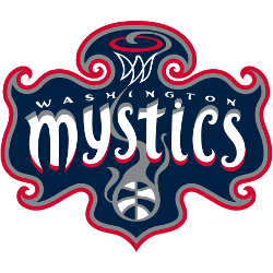
Wordmark “MYSTICS” in white with red trim with hoop and a WNBA basketball on a psychedelic dark blue, gray and red wavy banner.
Mystics Primary Logo
The Washington Mystics are one of the most successful teams in the Women’s National Basketball Association (WNBA). The team has been around since 1998 and has had a number of different logos over its history. Today, we’re going to take a look at the primary logo for this storied franchise.
The original logo was introduced when the team first began to play in 1998 and featured an abstract basketball with wings on either side, particularly in relation to the Washington Mystics Alternate logo. This design was used until 2005 when it underwent its first redesign to feature more traditional elements such as stars, stripes, and a bolder font choice for “Mystics” lettering across the top portion of the ball design. This version also included two additional stars representing Washington D.C., which is often referred to as “the District Of Columbia".
In 2011, another update occurred where they added three red stars above their name along with updated fonts that gave off more modern vibes while still maintaining some classic touches from previous designs; additionally adding navy blue into the color palette mix too! In 2017 they unveiled yet another new primary logo which features five white starts within a circle shape surrounding the wordmark - all set against a light blue background reminiscent of DC's flag colors & skyline silhouette behind it!

Washington Mystics
1998 - 2011
Wordmark "MYSTICS" in white with gold trim with hoop and a WNBA basketball on a psychedelic blue, black and gold wavy banner.
College Sports Fan Products


