Primary Logos

Anaheim Ducks
The current Ducks logo, the D-Foot simplified the previous logo that came before it in 2007 - 2013. Rather than spelling out the whole team name, the webbed "D" from the previous logo was enlarged…
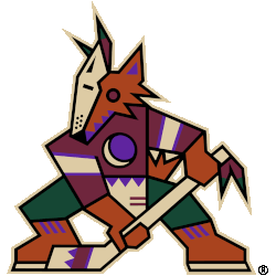
Arizona Coyotes
The Kachina logo returns as the Arizona Coyotes full-time primary logo. The logo remains the same as it did in the late 1990s, a kachina-doll style coyote posed in the shape of a letter "A"…
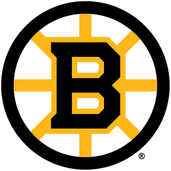
Boston Bruins
It features the modern serifed letter "B" in black, trimmed in gold within a black circle with eight golden spokes. The Boston Bruins logo was created specifically for their centennial season in 2024.
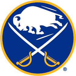
Buffalo Sabres
The Buffalo Sabres logo features a white buffalo, a symbol of good luck, leaping in between two crossed sabres on a royal blue circle trimmed in gold. The Sabres first adopted this style of logo…

Calgary Flames
The Calgary Flames return to their original logo and colors as the team goes retro for the 2021 season. The flaming letter "C," used by the team since their first season in Calgary in 1980…

Carolina Hurricanes
The 2000 logo changes to the "Eye of Hurricane" logo were very minor. Clean edges and colors is the only improvements to the logo.
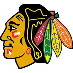
Chicago Blackhawks
The current Blackhawk logo is a side view of an native American with war paint on his face in red, black and white. His hair is black with a yellow outline and has four different…

Colorado Avalanche
The current logo has had a little shade added to it a few years later, but the actual logo hasn’t changed. The mountainous “A” stands prominently, with a streaking avalanche that wraps around and over,…
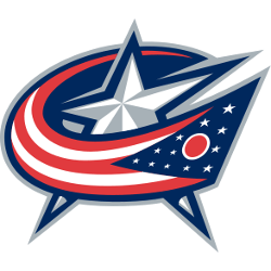
Columbus Blue Jackets
The red, white and blue flag is wrapping around the white and silver star in the background is the Ohio state flag, which is fitting for the only NHL team based in the state. And…
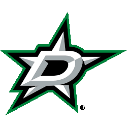
Dallas Stars
The logo was a silver, beveled star with a silver and black D, outlined in Victory green and silver. For the 2022 season, the Stars brightened the shade of green used on this logo to…
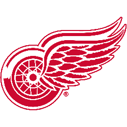
Detroit Red Wings
With the name Red Wings came a logo that has stood the test of time and represents a perfect fit with the Motor City. The crisp, clean, detailed, yet simple red and white look has…
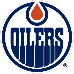
Edmonton Oilers
The Oilers' wordmark "OILERS" is in blue in the original custom font, as well as the encompassing blue ring, and the oil drop is orange in the top center. Colors to rematch their original 1979…
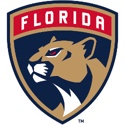
Florida Panthers
The new Panthers primary logo includes a more mature and stoic panther inside a shield with “Florida” set in a tab across the top of the mark.
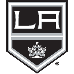
Los Angeles Kings
A black, white and silver pennant with the initials "LA" in white above a king's black, white and silver crown. In 2019, slight changes versus the old logo just one additional silver stripe is added…
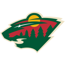
Minnesota Wild
The new and cleaner head of a black bear created using Minnesota-area scenery, green pine trees, a wheat colored river, a red sky, yellow sun set and white shooting star. The wordmark "Minnesota Wild" was…

Montreal Canadiens
The change to the current logo is again a closed red letter "C," with its top and bottom edges curling into each other in a symmetrical shape. The "C" and the "H" are fused together.…
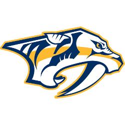
Nashville Predators
This logo is a slightly different take on the original, with an altered color scheme and simpler design. Also, the tiger’s eye now has a more distinct pupil. The logo features the side head shot…
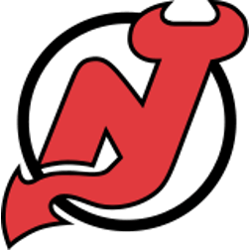
New Jersey Devils
The Devils' logo is a monogram of the letters "N" and "J" rendered with devil horns at the top of the "J" and a pointed tail at the bottom. The logo sits inside an open…
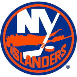
New York Islanders
Initials "NY" in white on blue with an orange outline circle with a hockey stick and puck and a map of Long Island below in orange. Four stripes added to the hockey stick represent four…
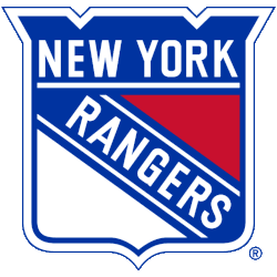
New York Rangers
A red, white, and blue shield with the wordmark "NEW YORK" across the top and "RANGERS" slanted across the shield. A new shade of blue.
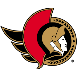
Ottawa Senators
Known as the Senators Centurion logo, this design features the profile of a Roman senator wearing a gold helmet placed inside a black circle. To the left is a red helmet decoration as well as…
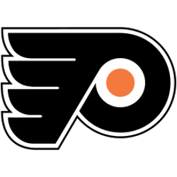
Philadelphia Flyers
A black P-Wing with an orange circle in the middle. The Flyers classic orange and black winged-P that oozes hard-nosed hockey and harkens back to the Broad Street Bullies days. The letter "P" stands for…
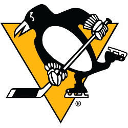
Pittsburgh Penguins
The Penguins released their 50th anniversary logo for the upcoming season, which had not a hint a Vegas gold — a lighter, more metallic color — but instead, featured the Lemieux-era Pittsburgh gold — similar…
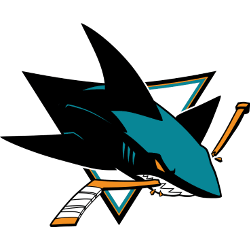
San Jose Sharks
The new and still active primary logo arrived for 2007 - 2008. The shark is much more three-dimensional, menacing, powerful. It’s bursting out of the logo to bite the hockey stick. Its teeth are razor…

Seattle Kraken
The original Kraken logo features a custom letter "S" in two tones of ice blue and dark blue. The red-eye of the Kraken has been affixed on its prey for some time. A single Kraken…

St. Louis Blues
The emblem the team proudly displays is called "the Blue Note." The Blue Note was taken from the music scale and represents the team's name. The classic note logo featured a blue note with wings…
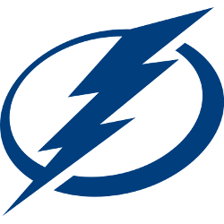
Tampa Bay Lightning
The current Lightning logo is a more traditional, simple look that removed the team’s name and city altogether. The circle around the bolt that has always been there remains, while the bolt itself is a…
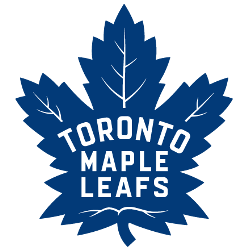
Toronto Maple Leafs
Inspired by the classic Leafs logo of the 1940’s to 1960’s, the club’s new mark has a number of design characteristics that distinguish it. On February 2, 2016, the team unveiled a new logo that…

Vancouver Canucks
A dark blue, white and grey Orca whale bursting out of the ice in the shape of a letter "C." The arched "VANCOUVER" wordmark removed for 2019 - 2020 season.
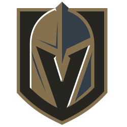
Vegas Golden Knights
A knight's helmet with a letter "V" in the negative space using the colors steel grey, gold, and black on top of a black with a gold trim shield.
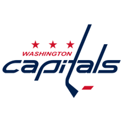
Washington Capitals
The “T” in Capitals forms a hockey stick that has a red puck next to it and the three stars along the top are an addition to the original look. The red, white and blue…

Winnipeg Jets
The design for the new logo, which was developed in partnership with Reebok and the NHL. The notch in the white portion appropriately and deliberately points north. The Jets logo is a grey jet flying…
Sports Fan Products


The history of NHL primary logos is a fascinating journey that showcases the evolution and branding efforts of each team within the league. Let's delve into the intriguing story behind the primary logos of NHL teams and how they have evolved over time.
In the early days of the NHL, primary logos were simple and often featured the team's initials or city name. These logos aimed to establish a recognizable identity for the teams. For example, the Montreal Canadiens introduced their iconic "CH" logo, which stands for "Club de Hockey Canadien." This classic logo has stood the test of time and is now one of the most recognizable symbols in all of sports.
As the league grew and teams sought to establish stronger brand identities, primary logos became more intricate and unique. The New York Rangers, for instance, introduced their famous shield logo in 1976. This logo features the team's initials within a shield, symbolizing strength and heritage. It has become a beloved symbol for the Rangers and their passionate fan base.
In the 1990s and early 2000s, a trend of more dynamic and aggressive logos emerged. Many teams introduced logos that reflected their on-ice style of play or adopted more modern design elements. The Detroit Red Wings, known for their storied history and success, have maintained a consistent primary logo featuring a winged wheel. This logo represents speed, motion, and the team's dedication to excellence.
In recent years, NHL primary logos have embraced a blend of tradition and modernity. Some teams have updated their logos to give them a fresh and contemporary look, while others have remained true to their original designs. The Toronto Maple Leafs, for example, reintroduced their classic logo in 2016 with a cleaner and more streamlined appearance, paying homage to their rich history while embracing a modern aesthetic.
NHL primary logos continue to evolve as teams strive to connect with fans and create a distinct visual identity. These logos serve as a symbol of pride, heritage, and the fierce competition that defines the NHL. From classic simplicity to bold and dynamic designs, primary logos reflect the passion and excitement of the teams and their dedicated fans.

