Seattle Storm
The new design retains the iconic image of the Space Needle, which sits within basketball ribs and adds inspiration from Mount Rainier for its shape. At the center, a lightning bolt evokes the intensity, power, and purpose of the Storm identity both on and off the court. The typeface of the wordmark “SEATTLE STORM” on the new logo features a thinner custom font.
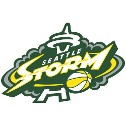
Seattle Storm
2016 - 2021
The Seattle Space Needle in the center and green and silver storm clouds with wordmark "SEATTLE" in white and STORM" in white with yellow and green trim. WNBA basketball in the lower corner.
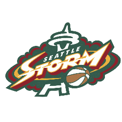
Seattle Storm
2000 - 2016
The Seattle Space Needle in the center and green and red storm clouds with wordmark "SEATTLE" in white and STORM" in white with red trim. WNBA basketball in the lower corner.
WNBA Seattle Storm Logo
With emerald green and yellow, the Seattle Storm logo reflects Seattle Storm WNBA pride. Since 2000, it defines Seattle Storm basketball intensity. For instance, Sue Bird’s leadership mirrors its boldness. Additionally, check the Seattle Storm Alternate Logo for more style. Therefore, this logo captures the team’s vibrant championship heritage in Seattle.
College Sports Fan Products

Hello, Storm Fans - Your Vote Matters!
Venture into the exciting WNBA Team Logo Battle, where the Seattle Storm logo goes head-to-head with rival teams. Designed as a bold “S” shaped storm with a basketball at its center, this emblem is more than just artwork—it reflects the Storm’s inspiring history and lasting strength.
Rooted in the fierce energy of Seattle, the logo embodies a team that is forceful, relentless, and loyal. Storm fans proudly wear it as a badge of devotion. In this spirited contest, the Seattle Storm logo doesn’t just stand out—it roars, symbolizing Seattle’s pride and determination.


