The Buffalo Bills, a renowned professional NFL team, has seen its logo evolve significantly. The team’s emblem, which has undergone four significant redesigns in its 61-year history, is a testament to its resilience and adaptability. This article explores the history and evolution of the Buffalo Bills logo, offering an in-depth examination of its transformations and the significance behind each design. …

Buffalo Bills Logo History, its Origin, and Variations
The well-known American professional football squad, the Buffalo Bills, has changed four logos throughout its half-century of existence. However, its fans always stayed loyal to this club in spite of all these alterations, as well as the fans of online Blackjack games for Philippines, are always faithful to their favorite online casinos. 1960 — 1961 / Bills Logo There is no …

Do Iconic Sports logos Lead to Successful Teams?
Sports are huge around the world and a typical way for many people to spend their spare time. Whether it is playing them or watching them, billions of people globally make sports a part of daily life. For the majority of these fans, it is essential to understand what makes a team successful. But why is this so important? Perhaps …

The Super Bowl Curse of Animal Logos
Here at sportslogohistory.com, we’re always fascinated by the origin and evolution of sport team logos. They can embody so much about a team, inspiring players and fans alike. Yet a team’s choice of name and logo can also have an unusual negative effect, as a close look at the Super Bowl statistics shows. This year, the Tampa Bay Buccaneers broke …
NFL Teams Logo Battle – Vote for the Best NFL Logos
Enter the high-stakes world of sports branding with our official NFL Teams Logo Battle. This interactive event invites passionate fans to rank the most remarkable and awe-inspiring marks in professional football. We have collected every current NFL teams logo to see which designs truly resonate with the fans. Consequently, your vote helps determine which iconic imagery represents the best NFL …
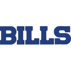
Buffalo Bills Logo NFL History – Wordmark Logo
The Buffalo Bills logo wordmark uses a modern sans-serif typeface, often displayed in bold blue or white. It complements the charging buffalo icon while standing firmly on its own. Clean, capitalized letters show strength and clarity, matching the team’s no-nonsense image. The typeface and layout have remained mostly consistent, showing how typography plays a key role in the Buffalo Bills …
NFL Logo – Wordmark Logos of All NFL teams
Explore every NFL logo wordmark for all 32 teams, from their earliest designs to today. This page covers the complete NFL logo history, including team logos and names. See how each NFL team’s logo has changed over time. Perfect for fans and researchers, this collection provides accurate, high-quality visual references in one convenient place.NFL Primary LogoNFL Alternate LogoNFL Logo BattleNFL …
NFL Logo History: Evolution of Team Logos and Iconic Designs
The NFL logo has a rich and fascinating history that reflects the growth of the league and its teams. Over time, these symbols became more than just graphics — they represent tradition, pride, and a deep connection with fans. This article explores the story of NFL logo history, and how these designs helped shape the identity of American football.NFL Logos …
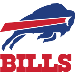
Buffalo Bills Logo NFL Pictures – Alternate Logo
The Buffalo Bills logo stands out with its motion and strength. Alternate designs highlight different parts of the team’s brand. This page covers the buffalo bills logo png, past changes, and the full buffalo bills logo nfl identity. You’ll also find a clean picture of buffalo bills logo to view or download. Buffalo Bills 1974 – Present The standing bison …
NFL Logo – Explore Every NFL Team’s Alternate Logos
The NFL logo isn’t just a symbol of the league—it also inspires every team’s identity. Beyond the primary emblems, alternate logos play a huge role in team branding. These designs appear on throwback jerseys, sideline gear, or limited-edition apparel. For fans who crave variety, alternate versions offer a bold take. Our collection highlights every NFL logo in alternate form, helping …
- Page 1 of 2
- 1
- 2