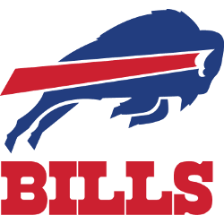
The Buffalo Bills, a renowned professional NFL team, has seen its logo evolve significantly. The team’s emblem, which has undergone four significant redesigns in its 61-year history, is a testament to its resilience and adaptability. This article delves into the history and evolution of the Buffalo Bills logo, providing an in-depth look at its changes and the meaning behind each …
Buffalo Bills Logo History, its Origin, and Variations
The well-known professional American football squad Buffalo Bills has changed 4 logotypes throughout a half-century of its existence history. However, its fans always stayed loyal to this club in spite of all these alterations, as well as the fans of online Blackjack games for Philippines, are always faithful to their favorite online casinos. 1960 — 1961 / Bills Logo There …
Do Iconic Sports logos Lead to Successful Teams?
Sports are huge around the world and a typical way for many people to spend their spare time. Whether it is playing them or watching them, billions of people globally make sports a part of daily life. For the majority of these fans, it is crucial to know what makes any team successful. But why is this so important? Perhaps …
The Super Bowl Curse of Animal Logos
Here at sportslogohistory.com, we’re always fascinated by the origin and evolution of sport team logos. They can embody so much about a team, inspiring players and fans alike. Yet a team’s choice of name and logo can also have an unusual negative effect, as a close look at the Super Bowl statistics shows. This year, the Tampa Bay Buccaneers broke …
Buffalo Bills Wordmark Logo
Bills Wordmark Logo The Buffalo Bills’ iconic wordmark logo has been a team staple for over 50 years. It was first introduced in 1962 and has undergone several iterations since then, but its basic design remains unchanged. The original logo featured the words “Buffalo Bills” written in white letters on a blue circle with red trim, while later versions added …
Buffalo Bills Alternate Logo
Bills Alternate Logo The Buffalo Bills have had an exciting logo history, with several designs over the years. The team’s original logo was a charging buffalo, which made its debut in 1960 when the team first joined the American Football League (AFL). This design remained until 1973 and featured a red-brown bison wearing a blue football helmet. In 1974, the …