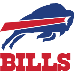
The Buffalo Bills, a renowned professional NFL team, has seen its logo evolve significantly. The team’s emblem, which has undergone four significant redesigns in its 61-year history, is a testament to its resilience and adaptability. This article explores the history and evolution of the Buffalo Bills logo, offering an in-depth examination of its transformations and the significance behind each design. …
Buffalo Bills Logo History, its Origin, and Variations
The well-known American professional football squad, the Buffalo Bills, has changed four logos throughout its half-century of existence. However, its fans always stayed loyal to this club in spite of all these alterations, as well as the fans of online Blackjack games for Philippines, are always faithful to their favorite online casinos. 1960 — 1961 / Bills Logo There is no …
Buffalo Bills Logo NFL History – Wordmark Logo
The Buffalo Bills logo wordmark uses a modern sans-serif typeface, often displayed in bold blue or white. It complements the charging buffalo icon while standing firmly on its own. Clean, capitalized letters show strength and clarity, matching the team’s no-nonsense image. The typeface and layout have remained mostly consistent, showing how typography plays a key role in the Buffalo Bills …
Buffalo Bills Logo NFL Pictures – Alternate Logo
The Buffalo Bills logo stands out with its motion and strength. Alternate designs highlight different parts of the team’s brand. This page covers the buffalo bills logo png, past changes, and the full buffalo bills logo nfl identity. You’ll also find a clean picture of buffalo bills logo to view or download. Buffalo Bills 1974 – Present The standing bison …
Buffalo Bills Logo History & Evolution of Primary Logo
The Buffalo Bills logo is a powerful representation of the team’s energy, speed, and legacy in the NFL. In 1974, the charging blue buffalo with a red streak has become one of football’s most iconic symbols. Whether you’re downloading the Buffalo Bills logo PNG for digital projects or viewing a high-quality picture of Buffalo Bills logo, this design remains a …


