
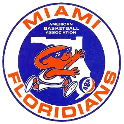
Miami Floridians
1969 - 1970
A orange headed man dribbling a ball across the state of Florida in a circle. Wordmark "MIAMI FLORIDIANS" in orange around the circle.

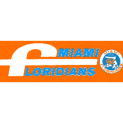
Miami Floridians
1969 - 1970
Alternate Logo
The Miami Floridians logo is on the right with the wordmark "MIAMI" in blue on top and a white letter "f" and "LORIDIANS" in blue.
"School Spirit Never Graduates"
From the first kickoff to the Final Four, your colors represent a lifetime of memories. Celebrate the traditions that define your campus and rep your alma mater with officially licensed gear for every season.
Shop the Official NCAA Collection









Miami Floridians Logo History
The Miami Floridians logo featured a vibrant basketball design with bold typography and patriotic color elements. Among vintage Miami logos, it stood out for its playful yet competitive identity. A closer look at the Miami Floridians logo history shows how the franchise used bright colors and clean shapes to create one of the most recognizable ABA team visuals of its time.
Throughout its seasons, the Miami Floridians logo remained consistent in theme while adapting slightly for uniforms and promotional materials. Compared with other Miami logos, the design embraced movement and energy, reflecting the fast-paced style of ABA play. The documented Miami Floridians logo history reveals how the team balanced creativity with clarity in its branding strategy.
Today, the Miami Floridians logo remains an important symbol of ABA heritage. The preserved Miami Floridians logo history ensures that this emblem continues to be appreciated by collectors and basketball historians. For more about the franchise’s journey, visit the Miami Floridians team history page. You can also explore another classic ABA design on our Memphis Tams logo page to compare primary logos across the league.