

Minnesota Pipers
1969 - 1970
Wordmark "PIPERS" in red on a blue basketball with wordmark MINNESOTA" in blue written above and "ABA BASKETBALL" below in blue.

Minnesota Pipers
1969 - 1970
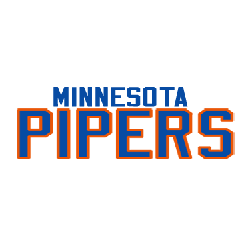
Wordmark Logo
Double-lined wordmarks "MINNESOTA" in blue and "PIPERS" in blue with orange trim.
"School Spirit Never Graduates"
From the first kickoff to the Final Four, your colors represent a lifetime of memories. Celebrate the traditions that define your campus and rep your alma mater with officially licensed gear for every season.
Shop the Official NCAA Collection










Minnesota Pipers Logo History
The Minnesota Pipers logo featured a clean and traditional basketball design that aligned with the visual trends of its era. As a symbol of Minnesota Pipers basketball, the logo incorporated bold lettering and classic sports elements to ensure visibility on uniforms and promotional materials. Within broader Minnesota logo history, this emblem stands out as one of the earliest professional basketball identities in the state. The strong typography and balanced layout made the Minnesota Pipers logo both functional and memorable.
Throughout its time in the ABA, the Minnesota Pipers logo remained consistent in structure while adapting slightly for print and merchandise applications. The branding supported the growth of Minnesota Pipers basketball and reinforced recognition among fans. When reviewing Minnesota logo history, the development of the Minnesota Pipers logo highlights how early franchises focused on clarity and strong wordmarks to build team identity.
Today, the Minnesota Pipers logo remains a valued part of ABA heritage. Preserved within documented Minnesota logo history, it reflects the foundation of professional Minnesota Pipers basketball branding. For a detailed look at the franchise’s journey, visit the Minnesota Pipers team history page. You can also explore another ABA primary emblem on our Minnesota Muskies logo page to compare early league designs.