
The Dawn of Atlanta City FC: A New Chapter in NWSL History
Atlanta has long waited for a permanent seat at the table of American women’s professional soccer. The arrival of Atlanta City FC as the league’s 16th franchise fills in the Southeast on a map that has skewed coastal and Midwestern for most of the NWSL’s existence, and it does so with a club built from the crest outward rather than assembled from the remnants of earlier ventures.
The Atlanta expansion fee reached a record $165 million — a figure that reframes what an ownership group is willing to pay for entry into a league that, not long ago, measured its franchise values in single-digit millions. That confidence is underwritten by distribution: the NWSL is currently operating under a four-year media rights deal valued at $240 million, giving the newest club a national broadcast window from its first competitive minute.
What makes this launch worth studying isn’t only the money. NWSL expansion 2026 marks the point at which the league’s naming conventions matured. Atlanta City FC borrows the visual grammar of a global soccer club rather than the nickname-driven shorthand that defined earlier women’s teams — a deliberate choice, and the foundation of everything that follows in the club’s identity.
Visual Identity: Decoding the Red and Georgia Peach Palette
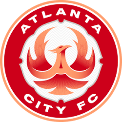
The Atlanta City FC branding rests on a two-tone foundation: a deep, saturated red paired with a soft, warm tone the club calls Georgia Peach. The pairing does real work. Red carries the weight and legibility a crest needs at broadcast scale, while Georgia Peach supplies the regional signature—a color pulled directly from the state’s most recognizable agricultural and cultural symbol rather than the standard athletics palette of navy, gold, and black.
“Georgia Peach isn’t decoration. It’s a declaration of where this club comes from.”
That distinction matters in a market already defined visually. Atlanta United’s identity leans on its vertical striping and a red-and-black contrast built for stadium-wide spectacle. Atlanta City FC moves the other direction, toward a quieter, more contained crest with fewer internal elements and cleaner line weights — the minimalist turn that has swept through NWSL design over the past several expansion cycles.
The result reads differently depending on where you sit. Locally, the peach tone functions as civic shorthand that needs no explanation. Nationally, it gives the Atlanta women’s soccer team a palette no other club in the league owns, which is the entire point of a signature color in a sixteen-team competition.
Moving Beyond the Beat: Why the Legacy Moniker Was Shelved
The Beat name carries genuine history in this market. It belonged to Atlanta clubs across two earlier eras of top-flight American women’s soccer, and both times the league around it folded before the brand could compound into something durable. Reviving it a third time would have meant inheriting that pattern—a name local fans associate as much with discontinuation as with competition.
The ownership group chose a clean slate instead, and the logic is structural, not sentimental. “Atlanta City FC” translates immediately in any soccer market on earth; “Beat” requires explanation outside Georgia. For a club whose matches will be distributed nationally from day one, legibility beats nostalgia.
Honoring the past without being governed by it is the harder balance, and the club has signaled several mechanisms for it:
- A Ring of Honor recognizing players from Atlanta’s previous professional women’s sides.
- Permanent historical displays at the training facility documenting the Beat era’s rosters and results.
- Alumni programming that brings former players into matchday and community work as active participants, not archival footnotes.
The history stays visible. The brand starts fresh.
The Mercedes-Benz Stadium Configuration for NWSL Matches
Mercedes-Benz Stadium was engineered for scale, which presents an obvious problem for a women’s professional club building its first season of demand. The solution is the venue’s automated curtaining system, which drops to close off the upper bowl and concentrates the crowd into the lower seating tiers. Sound reflects downward, sightlines tighten, and a crowd that would read as sparse in the full configuration reads as dense and loud.
| Element | NWSL Configuration | Full Stadium Configuration |
|---|---|---|
| Seating bowl | Lower tiers only, upper deck curtained | All tiers open |
| Atmosphere | Intimate, concentrated, supporter-section driven | Broad, spectacle-scale |
| Operational footprint | Reduced concessions and gate activation | Full building activation |
Away from downtown, the Marietta training facility carries equal strategic weight. Dedicated training infrastructure is the line separating a club with permanence from a tenant with a lease — it anchors daily operations, player development, and the youth pathway that feeds a Georgia women’s soccer team over decades rather than seasons.
The downtown venue also reinforces the naming logic. A club called “City” that plays in the civic and commercial center of its metro area is making a geographic argument as much as a branding one.
The Business Case: Profitability and the $165 Million Entry
The NWSL expansion fee for Atlanta set a new benchmark at $165 million, and that number functions as a thesis about where the league’s valuations are heading rather than a reflection of present-day operating income. Expansion fees price future access: to a media window, to a growing national audience, and to a market that hasn’t been properly served.
The honest question isn’t whether Atlanta City FC can sell tickets — it’s how quickly an NWSL franchise reaches sustainable operating profitability.
Most clubs in the league build revenue from four roughly equal pillars: ticketing, local and league-wide sponsorship, merchandise, and the distributed share of national media money. Atlanta’s advantage sits squarely in the second pillar. The metro area hosts one of the densest concentrations of Fortune 500 headquarters in the country — beverage, airline, logistics, and media companies with established women’s sports activation budgets and a vested interest in local visibility.
Media distribution does the rest. A guaranteed national broadcast platform turns a new club from a regional ticketing business into a property sponsors can value for its reach. That shift is what makes a nine-figure entry price defensible rather than speculative.
The Bottom Line: What Fans Need to Know About Atlanta City FC
- The name is Atlanta City FC. The club adopted global soccer naming conventions rather than reviving a legacy nickname, prioritizing immediate international legibility over local nostalgia.
- Home matches will be played at Mercedes-Benz Stadium in a reduced lower-bowl configuration, with the venue’s automated curtaining system closing the upper deck to concentrate atmosphere.
- The color palette pairs a deep red with Georgia Peach, a regionally specific tone that gives the club a visual signature no other NWSL side owns and distinguishes it from Atlanta United’s established striping.
- The Beat era will be honored, not reinstated. A Ring of Honor, training facility displays, and alumni programming preserve the history of Atlanta’s earlier professional women’s teams without tying the new club’s brand to leagues that no longer exist.
- The Marietta training facility is the permanence signal. Dedicated year-round infrastructure separates a club building a development pipeline from one renting a stadium date, and it’s the clearest sign that the new Atlanta soccer team is built for decades, not seasons.
Tracing the Evolution of Atlanta’s Sports Identity
Place Atlanta City FC alongside the city’s earlier marks — the baseball scripts, the raptor-era basketball experiments, the stripes of its MLS side — and the trajectory becomes legible. Atlanta’s visual history has swung between aggressive reinvention and civic understatement, and the new club lands firmly in the latter camp: restrained typography, a limited palette, and a regional color doing the emotional work that a mascot once did.
That’s the larger story here. Women’s professional soccer branding has moved from niche nicknames designed to signal novelty toward city-first identities that assume the same seriousness afforded any major-league franchise. Atlanta City FC is the clearest expression of that shift yet, and whether the “City FC” convention proves durable or becomes a marker of this particular moment is a question only time and the archive can answer.
Documenting these shifts as they happen matters, because crests get retired, palettes get revised, and institutional memory fades faster than fans expect. For a full chronological look at sports logo history Atlanta has produced across every league and era, explore the Sports Logo History archive — the context behind the newest crest is already there.