
Every few seasons a franchise announces that an old uniform is coming back, and the reaction follows a predictable script: delight from the fans old enough to remember it, curiosity from everyone else, and a merchandise run that sells out before kickoff. What is less obvious is why the NFL suddenly has so many throwbacks, including the popular NFL throwback logos, to bring back at all. For most of the last decade, a single equipment rule kept a large share of the league’s design history sitting in storage. When that rule was lifted, it did more than change what teams wear on a Sunday in October. It changed how clubs think about the marks they once retired.
The Rule That Kept the Archive Locked
For years the NFL permitted each team only one helmet shell per season, a restriction adopted on safety grounds. It sounds like equipment-room housekeeping, but it shaped the league’s visual identity more than any design trend of the same period. Most great NFL throwback uniforms are inseparable from a helmet in a different color — an orange shell, a white shell, a shell with a hand-drawn figure on the side. Under a one-helmet policy, those uniforms were effectively unwearable. Teams could reprint the jersey, but the head-to-toe look never came together, and clubs quietly stopped trying.
These cherished designs remind fans of the glory days and connect the present with the past, showcasing the rich history embedded in NFL throwback logos.
That changed when the league approved alternate helmets beginning in the 2022 season, allowing teams to pair a second shell with their Alternate, Classic, or Color Rush uniforms, provided they met fitting and practice requirements. The league’s own announcement named the three franchises everyone had in mind: Tampa Bay’s creamsicles, Philadelphia’s kelly greens, and Pat Patriot in New England. Within two seasons, all three were back on the field, joined by Seattle’s 1990s look and a Tennessee revival of a franchise that no longer exists.
Bucco Bruce and the Case for Orange
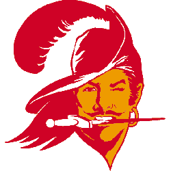
The Tampa Bay Buccaneers spent their first twenty-one seasons, from 1976 through 1996, in orange and red. Lamar Sparkman, a cartoonist at the Tampa Tribune, drew the mark: a swashbuckler in profile with a wide-brimmed plumed hat, flowing hair, a hoop earring, a dagger clenched in his teeth, and — the detail that has kept the logo alive in conversation for fifty years — a wink. The color scheme nodded to the region’s citrus industry and sunshine, and the nickname it earned, creamsicle, has outlasted every attempt to replace it.
Tampa Bay moved on in 1997, swapping Bucco Bruce for a Calico Jack pirate flag with a skull, crossed swords, and a football, in red and pewter. By the standards of the era, it was a smart and successful rebrand. It also wasn’t what people asked for. When the Buccaneers returned the creamsicles to the field in 2023, they were reviving not a better logo so much as a warmer one. You can read the full progression from Bucco Bruce to the tattered flag and see the change in intent immediately: one mark is a character, the other is a crest. Character logos are almost impossible to design now, because no modern identity process would sign off on a wink.
Pat Patriot and the Reproduction Problem
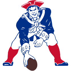
New England’s story is the cleanest illustration of why so many beloved logos were retired in the first place. Phil Bissell, an artist at the Boston Globe, created Pat Patriot and served the franchise from 1960 through 1992: a Revolutionary War soldier in full regalia, crouched over a football and ready to snap it. It is a genuinely excellent drawing. It is also a nightmare to reproduce. Fine linework, layered detail, and a busy silhouette do not survive embroidery, screen printing on a curved helmet, or a broadcast feed from thirty years ago.
The Flying Elvis, designed by NFL Properties and introduced in 1993, solved that problem: a modernized patriot’s head with a flowing red, white, and blue cap that read at any size. The nickname came from the resemblance to a certain pompadour, and the mark has been refined only lightly since, including a darkened blue for screen clarity. The trade was legibility for personality, and it’s the same trade nearly every league made across the 1990s. The longer story of the Patriots’ identity makes plain that the switch was an engineering decision dressed as a design decision — which is exactly why bringing Pat Patriot back as a throwback works. Nobody is asking him to carry a merchandise program anymore. He only has to look right for one afternoon.
Philadelphia’s Two Greens
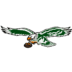
The Eagles case is different again, because the nostalgia isn’t really about the logo. Philadelphia’s primary mark has changed a dozen times since 1933, from a blue eagle clutching a football to the helmet-and-wings device of the 1970s and 1980s, to the 1987 version flying right to left with white accents through its body. In 1996, the club adopted the white bald eagle head still in use today, drawn in a cartoon style with a silver border for a three-dimensional effect — and, at the same time, replaced Kelly green with midnight green.
When the Kelly greens returned in 2023 for the first time since 2010, the reaction was about the color. That is worth noting for anyone studying sports identity: a palette can carry more memory than a mark. Fans who could not describe the 1987 Eagles from memory can tell you exactly what shade of green the team wore when they were twelve.
The Derrick That Moved to Nashville

The strangest revival in the recent wave belongs to a team that hasn’t existed since 1996. The Houston Oilers played from 1960, cycling through an oilman in a gold cowboy hat before landing on the mark that stuck: a helmet with an oil derrick on the side, first as a plain line drawing from 1969, then in thick blue with a red derrick, and finally, from 1980 to 1996, as a clean blue derrick on white with a red outline. The franchise became the Tennessee Oilers in 1997 and the Titans in 1999.
The Titans have since worn Luv Ya Blue-era Oilers throwbacks — a different name, a different city, a different color scheme, honoring a period most of the current roster was not alive for. It should not work. It does, because the derrick is a genuinely good design: one idea, one color, instantly readable at any distance, and specific to a place in a way almost no contemporary NFL logo is.
What Separates a Throwback From a Costume
The revivals that land have a few things in common. They keep the era’s craft rather than redrawing it with modern vector polish, because the slight irregularity of a hand-drawn mark is the point. They treat color as the primary carrier of memory. They complete the look, which is why the helmet rule mattered so much. And they exercise restraint — one or two appearances a season, not a second
full-time identity. A throwback worn every week stops being a throwback and becomes a costume the team is stuck inside.
The Archive as an Asset
The practical consequence of all this is that NFL clubs no longer treat retired marks as dead weight. Old artwork is now inventory: cataloged, licensed, re-cut for modern production and scheduled across a season like any other asset. That artwork also moves between club staff, licensees, and outside design studios for months before a reveal, which is why teams increasingly ask partners to work behind a small-business VPN when files are reviewed on hotel or press-box WiFi. A leaked throwback is a spoiled announcement, and announcements are a meaningful part of what these programs are worth.
Closing
The 2022 rule change did not create nostalgia for NFL logos; that was never in short supply. It removed the logistical excuse. Given permission, teams reached straight back into the 1970s and 1980s — to a cartoonist’s winking pirate, a Boston illustrator’s minuteman, a shade of green, an oil derrick — and found that the work still holds up. Those marks were not retired because they were bad. They were retired because they were hard to print, hard to shrink, and out of step with a decade that wanted everything sharpened and italicized. Judged on the only criterion that matters now- whether people recognize it and want to wear it- the archive is beating the current catalog more often than the league probably expected.