
AFC Bournemouth
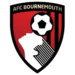
In 2013, we get an updated version of AFC Bournemouth's crest. Now with a classy looking shield with the continuation of football and the player's head in black and white on a red and black background. Above the football is a golden wordmark "AFC BOURNEMOUTH" across the top.
Arsenal FC
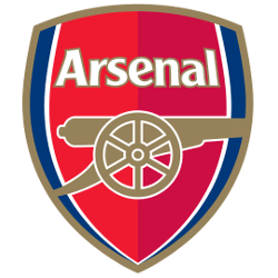
A multi-colored shield with a side view of a gold with white trim cannon below a wordmark "Arsenal" in white with gold trim.
Aston Villa FC
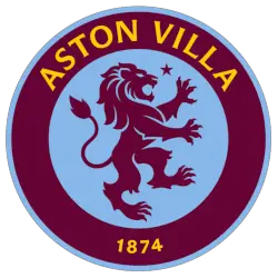
A standing lion in maroon centered on a blue background with the wordmark "ASTON VILLA" and "1874" in gold on the maroon with blue trim outside ring.
Brentford FC
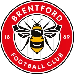
A black, yellow, and white bumble bee centered on a white circle background, with a red border with white and black trim. Wordmark "BRENTFORD" and "FOOTBALL CLUB" encircled in white with the split year of 1889 in white.

Brighton & Hove Albion FC
The club's current crest was introduced in 2011 a modernized version of their 1977 iteration. The seagull is now flying the opposite direction than past marks with an encircled wordmark "BRIGHTON & HOVE ALBION" in blue on a white background.
Coventry City FC
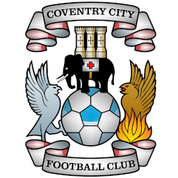
The crest of Coventry City Football Club centers on a traditional soccer ball patterned in white and sky blue, flanked by two mythical heraldic creatures and framed by silver scrolls reading COVENTRY CITY at the top and FOOTBALL CLUB at the bottom. Perched atop the ball is a black elephant facing left, carrying a three-turreted stone castle on its back alongside a saddlecloth bearing a red cross. To the left, a light-blue or silver eagle stands facing inward with wings raised, while on the right, a golden phoenix rises from bright yellow and orange flames, creating a balanced, heraldic composition rich with traditional civic symbolism.
Chelsea FC
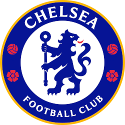
A blue heraldic lion holding a staff, surrounded by a blue ring with two red footballs and roses. The blue ring also includes an arched wordmark "CHELSEA" at the top and "FOOTBALL CLUB" at the bottom in white. Specific tweaks include a deeper base blue, removing various yellow and white borders, simplifying the central lion to a flat 2D graphic, and updating the typography to match the club's bespoke typeface.

Crystal Palace FC
In advance of the 2013 playing season, the Crystal Palace created a new logo, which actually looks more like the 1973 badge than the 1993 logo. The now aggressive phoenix in blue and white clutching a football towering above the crystal palace in silver. A blue with a red trim banner with the wordmark "CRYSTAL PALACE F.C." in white.

Everton FC
An updated version of the crest was used for 2013/14 but this proved unpopular with supporters so a wide-ranging consultation exercise was undertaken which resulted in the production of three new crests. These were put to a fan vote and the current crest was the overwhelming winner. It was introduced formally in July 2014. Therefore, in 2014, the management kept a promise and changed the emblem to a new-old design. The name of the club and the year of its foundation were moved to the middle of the shield, under the tower. The emblem was made in a two-color version (blue and white).
Fulham FC
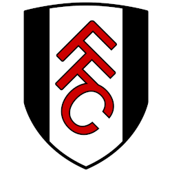
In 2001 following Fulham's promotion to the Premiership, the current Club's crest has a solid looking shield in black and white with initials of "FFC" horizontally positioned and connected in red with black trim.
Hull City AFC
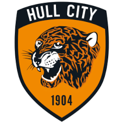
The emblem of Hull City Football Club is set inside a traditional pointed shield outlined by a thick black border. Across the arched black header at the top, the club's name, HULL CITY, is printed in bold, sans-serif white capital letters. The core of the crest features a vibrant amber-orange field dominated by a stylized, roaring tiger head facing left, rendered with sharp black tribal-like stripes, white facial highlights, bared fangs, and delicate whiskers. Centered directly below the tiger in the lower point of the shield is the club's founding year, 1904, displayed in clean, narrow black numerals.The emblem of Hull City Football Club is set inside a traditional pointed shield outlined by a thick black border. Across the arched black header at the top, the club's name, HULL CITY, is printed in bold, sans-serif white capital letters. The core of the crest features a vibrant amber-orange field dominated by a stylized, roaring tiger head facing left, rendered with sharp black tribal-like stripes, white facial highlights, bared fangs, and delicate whiskers. Centered directly below the tiger in the lower point of the shield is the club's founding year, 1904, displayed in clean, narrow black numerals.
Ipswich Town FC
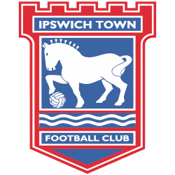
A castle shape shield in red with a white outline and the wordmark "IPSWICH TOWN" in white on a blue with white trim background above a horse holding a soccer ball in white on a blue background with white trim above two wavy lines and a wordmark "FOOTBALL CLUB" in white with a white outline.
Leeds United FC
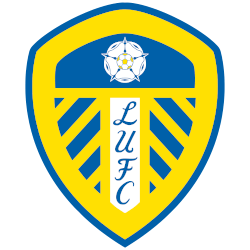
For the 2002 season, a slight change to the color blue, as the same design and layout continued from the previous logo.

Liverpool FC
In 1999, Liverpool added to the top of the emblem a stylized image of the Shankly Gate arch from the Enfield Stadium, adorned with the most famous words from the club anthem called “You’ll Never Walk Alone”. The burning torches on the sides of the shield are a symbolic image of the lights at the Hillsborough memorial in Sheffield.
Manchester City FC
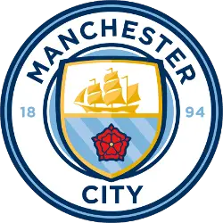
December 26, 2015, Manchester City introduced a new emblem of the club before the match with Sunderland. As promised, the Manchester City logo was designed in a round shape and executed in two colors: 94% of fans preferred the blue color, and 68% – the white one. Also, fans chose the elements of the picture: 85% appreciated a ship, the symbol of Manchester, 67% chose three rivers (Irwell, Irk and Medlock), and 60% picked out a red rose, the symbol of the county of Lancashire. The logo has a round shape again with a shield inside, where the golden ship and the red rose are featured. All the lines are painted in the dark blue color and complemented by light blue. The year of the club foundation is painted blue 1894. Finally, the arched wordmark is back "MANCHESTER CITY" in blue.

Manchester United FC
The upper part of the inner shield of the Manchester United crest displays a ship that actually originates from the Manchester City Council coat of arms (a ship can likewise be found on Manchester City’s logo). Below the ship, there is a bigger drawing depicting a devil – the devil was first incorporated on the crest in 1970. A minor change was done in 1998 when "Football Club" was removed from the bottom banner. Instead, the banners only text out "Manchester United."
Newcastle United FC
It was decided to go back to the team’s roots and refine the original coat of arms of Newcastle upon Tyne. Thus, composition artists added a shield, painted black and white stripes, which recalls team shirts. But the turret over the shield remained the same. The royal lion with the flag of St. George symbolizes the exploits of the city, which was attacked several times in the 14th century and besieged by Scots during the civil war. Speaking about two seahorses, they remained on the emblem, but the inscription “brave defenders” was replaced by the name of the club. There was no place on the modern Newcastle logo only for the magpie, but the nickname of the Newcastle players was fixed in people’s minds forever.
Nottingham Forest FC
A red Sherwood tree emerges from wavy lines, representing the river Trent with a wordmark "FOREST" in red. Forest has two stars above the club badge to commemorate the European Cup victories in 1979 and 1980.

Sunderland AFC
It is composed of a red and white shield, divided into four segments — red and white stripes on the upper right and lower left ones, and solid red with golden details for the upper left and lower right ones. The shield features a red, black, and white ornament at its top, with a red ribbon running horizontally across it. Two black lions are placed on either side of the crest, making it appear more traditional and heraldic. The wordmark is now written in white over the red ribbon, arched under the crest.
Tottenham Hotspur FC
In 2025, the Tottenham Hotspur logo has removed the wordmark that was below the cock on the ball from the previous logo. This logo is in blue and white.
Evolution of Premier League Teams Logo Designs
The Premier League logo history began with a lion holding a football, symbolizing the pride of English soccer. Over time, individual premier league teams logo styles shifted to reflect both tradition and modern branding needs. For example, Arsenal introduced its iconic cannon emblem to honor its royal heritage. Similarly, Manchester United updated their crest in 1998 to feature the legendary Red Devil. These changes helped the premier league logo maintain a professional and marketable image across the globe.
As the new millennium arrived, many clubs opted for cleaner aesthetics. Chelsea debuted a regal lion in 2005 to signal a new era of ambition. Likewise, you can see how the Manchester City logo evolved from a complex shield to a sleek, circular design in 2016. Because global audiences grew, the premier league logo and club badges became more minimalist. This trend ensures that a premier league teams logo remains clear on digital screens and mobile devices.
A Lasting Legacy in Premier League Logo History
Ultimately, every premier league logo serves as a rallying point for millions of passionate supporters. You can explore the full Premier League history to learn about the iconic moments associated with these symbols. We provide a complete record of every premier league teams logo to preserve the rich heritage of the competition. By documenting the premier league logo history, we help fans connect with the values and aspirations of their favorite clubs. These emblems are not just graphics; they are the heart of football culture.
"Wear the Badge. Feel the Passion!"
Secure the latest 2026/27 kits, authentic training wear, and official club accessories. Whether you’re cheering from across the pond or traveling to the stadium, rep your club with the same gear the pros wear.
Get Your Kit – Official Premier League Shop


