Everton FC
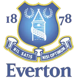
An updated version of the crest was used for 2013/14 but this proved unpopular with supporters so a wide-ranging consultation exercise was undertaken which resulted in the production of three new crests. These were put to a fan vote and the current crest was the overwhelming winner. It was introduced formally in July 2014. Therefore, in 2014, the management kept a promise and changed the emblem to a new-old design. The name of the club and the year of its foundation were moved to the middle of the shield, under the tower. The emblem was made in a two-color version (blue and white).

Everton FC
2013 - 2014
May 25, 2013, Everton announced the change of logo, but in two days, more than 14 thousand fans signed an online petition asking the leadership not to touch the emblem. The new logo lacks the club’s motto, which had been represented there since 1938, as well as a pair of wreaths, the long-standing symbol of Everton. The leadership of the club gave credence to their fans and in several days announced that this emblem will be used only for one season. The reason for such decision is that the new version had already been put into production.
Everton FC
2000 - 2013
In 2000, following the trends of contemporary design, the club changed some colors and added a wordmark. Also, added the year of the club formation "1878," dividing it into 2 and placing on both sides of the shield. In addition, the wordmark “Everton” appeared under the motto of the club.
Everton FC
1991 - 2000
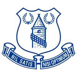
A white with blue trim shield with the tower centered and on either side is the laurel wreathes in blue. Under the shield, there was an inscription in Latin “Nil Satis Nisi Optimum”, which means “Only the best is good enough.”
Everton FC
1983 - 1991
Everton's next crest has letters "EFC" in blue above a slightly reshaped Tower and laurel wreathes in yellow.
Everton FC
1982 - 1983
In 1982, a simplified, circular design was produced, with the shield and the Latin motto removed. In yellow is the tower and two laurel wreaths with an arched wordmark above "EVERTON" on a blue with white trim.
Everton FC
1978 - 1982
In 1978, came the return of the Tower. This was the first time Kelly's design had been used on the kit and it remained for four years. At the top of a white with blue trim circle background is a wordmark "EVERTON F.C." in blue. Under the shield, there was an inscription in Latin “Nil Satis Nisi Optimum”, which means “Only the best is good enough.”

Everton FC
1976 - 1978
Here is the simplified font for the 1976 emblem "EFC" letter in blue.

Everton FC
1972 - 1976
There was no crest of any type on the Everton jersey until 1972, when white ‘EFC' letters were simply embroidered onto the shirt. This lasted for four seasons before a simplified font was introduced instead.
Everton FC
1938 - 1972
At the end of the 1937/38 season, Everton’s secretary Theo Kelly, who later became the head coach of the club, decided to design a new club logo. In Everton, the district of Liverpool, you won’t find a building older than the Prince Rupert’s Tower, built in the late eighteenth century. Therefore, designers decided to put this image on the club’s emblem. Near this, they added two laurel wreaths, enclosed in a shield, symbolizing victory. Under the shield, there was an inscription in Latin “Nil Satis Nisi Optimum”, which means “Only the best is good enough.” For the first time, the Everton’s logo was demonstrated in 1939.
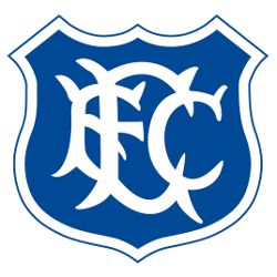
Everton FC
1920 - 1938
The first official Everton logo was introduced in 1920. It consisted of interwoven custom font "EFC" letters in white color, which were located on top of the shield with a blue with white trim background.
Everton FC Logo History
The Everton FC logo history officially adopted the iconic tower imagery in 1938. Secretary Theo Kelly designed a crest featuring the 18th-century lock-up located in Everton Brow. Therefore, this Everton soccer logo became a permanent fixture on the team's matchday programs and merchandise. This classic Everton fc logo also included the Latin motto, "Nil Satis Nisi Optimum," meaning "nothing but the best is good enough." This philosophy has guided the club for over a century.
Furthermore, the club refined the Everton soccer logo during the late 20th century to include laurel leaves and white stars. These elements in the Everton FC logo history represent the club's numerous domestic triumphs and historical glory. You can visit our Liverpool FC logo page to see how their Merseyside neighbors evolved their own liver bird crest. Ultimately, the Everton fc logo was updated in 2014 after extensive fan consultation. This modern version restored the traditional shield shape that supporters deeply cherish.
The Everton FC logo remains a powerful symbol of community and pride for the people of Liverpool. You can explore the full Everton FC history to learn more about the milestones achieved under this banner. We provide high-resolution versions of every Everton soccer logo to ensure the club's visual heritage is preserved. Every update in the Everton FC logo history reflects a unique era of English football. Consequently, the tower and laurel leaves continue to inspire future generations of Toffees.
College Sports Fan Products


