Liverpool FC
In 1999, Liverpool added to the top of the emblem a stylized image of the Shankly Gate arch from the Enfield Stadium, adorned with the most famous words from the club anthem called “You’ll Never Walk Alone”. The burning torches on the sides of the shield are a symbolic image of the lights at the Hillsborough memorial in Sheffield.

Liverpool FC
2017 - 2018
In 2017, FC Liverpool has a new emblem that was created for the 2017 - 2018 playing season, to mark the team’s 125th anniversary. The full shield looks exactly as its predecessor, apart from the dates “1892” and “2017,” which is positioned on either side. The first date is the year when the club played its first game, while 2017 is the year of its 125th anniversary. Also, the text “125 years” in red appeared below the shield.

Liverpool FC
1993 - 1999
Following the club's centenary year, a slightly amended badge with added color of yellow. The eternal flames were added in memory of the victims of the Hillsborough disaster in an adapted crest used from 1993 until it was superseded in 1999.
Liverpool FC
1992 - 1993
To mark the club's 100th year, this special crest was commissioned and used throughout the 1992 - 1993 season. The Shankly Gates, including the lyrics of the club's anthem 'You'll Never Walk Alone', were another significant addition.
Liverpool FC
1987 - 1992
The kits for the 1987 season featured an updated Liverpool FC logo, in which the shield shape appears again, together with the words “Liverpool Football Club” in red.
Liverpool FC
1968 - 1987
Liverpool opted to change the crest once more in 1968. This version did away with the oval that had previously surrounded the Liver bird. In red below the Liver bird is the arched initials "L.F.C." in red.
Liverpool FC
1955 - 1968
A redesign in 1955 featured the initials "L.F.C." to the crest below the Liver bird. Now adding a red oval circle surrounding the Liver bird.
Liverpool FC
1950 - 1955
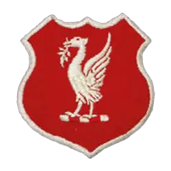
By the 1950s, the club had moved to a more stripped-down design featuring a single Liver bird. The simplified logo now is red with a white trim shield showing the Liver bird holding a leaf in white.
Liverpool FC
1940 - 1980
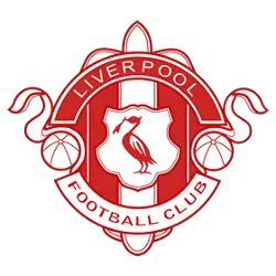
By the late 1940s, the club also had an alternative crest that was used on merchandise, match day programs, letterheads and more. This red and white emblem features the Liver bird in the center with two footballs on either side and a arch wordmark "LIVERPOOL" in white on top and "FOOTBALL CULB" in red on the bottom.
Liverpool FC
1892 - 1940
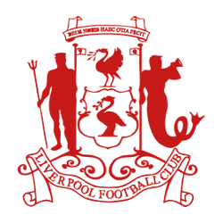
The club initially took up the city of Liverpool's coat of arms as its emblem. The design features the Roman god of freshwater and the sea, Neptune, and the Greek god and messenger of the sea, Triton. They flank two Liver birds, or cormorants, while the Latin phrase above reads "God hath granted us this ease". At the bottom is a ribbon with the wordmark "LIVERPOOL FOOTBALL CLUB" in red.
Liverpool FC Primary Logo
Liverpool FC is one of the most successful and popular football clubs in the world. Since its founding in 1892, Liverpool has had a long history of iconic logos which have come to symbolize its success on and off the field. The primary logo for Liverpool FC has gone through many iterations over time, but it always remains true to its original design elements while being adapted to fit modern trends.
The first official logo was designed by John Houlding and introduced when Liverpool Football Club was founded in 1892. This classic crest featured two liver birds facing each other with a shield between them that contained three small images representing shipbuilding, commerce, and industry; all important aspects of life at that time for citizens living near Merseyside’s River Mersey. This emblem remained unchanged until 1955 when an updated version was created featuring an enlarged Liver Bird surrounded by laurel leaves as well as redesigned text reading “LIVERPOOL FOOTBALL CLUB ESTABLISHED 1892."
In 1992 another redesign took place which saw some minor changes such as larger lettering surrounding the bird along with more detail added around him including stars from Europe's flags above his head signifying European Cup victories achieved during this period (1984-2005). Finally, in 2020 yet another revision occurred where they removed any text outside of their name so now only "Liverpool" appears next to their signature Liver Bird mascot who still stands proudly atop his red shield within a white border - just like he did back in '1892! All these versions are a testament not only to how much times have changed since then but also to how dedicated supporters remain loyal even after years go by without major updates or changes being made - something truly special about what makes up LFC!
College Sports Fan Products


