Leeds United FC
For the 2002 season, a slight change to the color blue, as the same design and layout continued from the previous logo.
Leeds United FC
2019
For the 100 year anniversary, Leeds United brings us a gold version of their 2002 logo. Adding to the now gold and black current crest with the wordmark across the top "LEEDS UNITED" and the years on both sides of the shield "1919 - 2019." Below the shield is a gold banner with "100 YEARS" in white.
Leeds United FC
2018
January 24, 2018, Leeds United, designed a new badge called "Leeds Salute." White, yellow, and blue – the club colors are observed. A wordmark “LEEDS UNITED” in white is located at the top of the shield on a blue background. A blue and white headless man, who was beating himself with the right hand in the chest on a yellow background. The logo was subject to mass backlash on social media and the new crest was scrapped hours after its announcement.
Leeds United FC
2000 - 2002
Changes to the shield logo as the 3-D effect was removed to a flat image. Same colors of white, yellow, and blue with the rose at the top and the initials down the center "LUFC."
Leeds United FC
1998 - 1999
In the 1998 - 1999 season, the club logo was replaced with a more "European" shield design. The shield retained the white rose, as well as the blue, gold, and white colors in a 3-D look, with the initials "LUFC" reading vertically down the center.
Leeds United FC
1997 - 1998
In 1997, Leeds United made a slight change to their logo by changing the Yorkshire rose to a white and a darker blue rose, same ball of white and yellow colors, on a darker blue background.
Leeds United FC
1984 - 1997
New design in 1984, a white and light blue Yorkshire rose, a ball of white and yellow colors, on a darker blue background. This is the first emblem of the club, in which white is the dominant color.
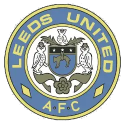
Leeds United FC
1981 - 1984
Leeds United finally serve up a new crest with the established nickname as the Peacocks. The new logo is a round shape, a blue stroke a wordmark "LEEDS UNITED AFC," and a blue and gold peacock in the center.

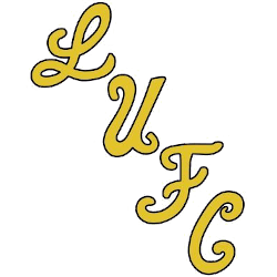
Leeds United FC
1977 - 1981
In 1977, Leeds United brought back the original design in 1973 of the letters "LU" in a darker shade of blue.
Leeds United FC
1976 - 1977
A third version of the abstract letters "LU" in a circle with gold background and a blue trim.

Leeds United FC
1975 - 1976
In 1975, the designer tried correcting the logo by unfolding the previous logo by 45 degrees and reversed the blue and gold color. This logo lasted only one season.

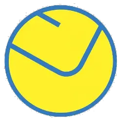
Leeds United FC
1973 - 1975
According to the designer’s concept, the logo is a yellow soccer ball with the letters "L" (Leeds) and "U" (United) on a blue circle background.
Leeds United FC
1965 - 1973
The next Leeds United logo lasted only two years. An inscription of the initials "LUFC" (Leeds United Football Club) in a diagonal style in gold with black outline.
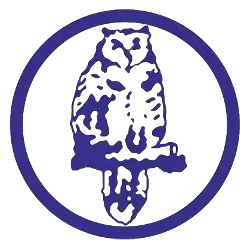
Leeds United FC
1960 - 1965
The second emblem for Leeds United replaced the coat of arms of the city, which had been used as the logo for more than half a century. It continues the “owlish” traditions in blue with a circle around the owl.
Leeds United FC
1919 - 1960
The logo virtually represents the city’s coat of arms. It is created in blue and gold colors, which are considered to be traditional ones for Leeds. It is quite curious that in the first half of the 20th century, Leeds’ common nickname, along with Sheffield Wednesday, was “owls,” although the team from Sheffield had the emblem with this bird only in 1956.
Leeds United FC
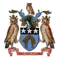
1908 - 1919
From 1908 - 1919, the Leeds City Crest is the Leeds Coat-of-Arms developed over a period of time. The owls came from the Coat-of-Arms belonging to Sir John Savile the first Alderman of Leeds. The inscription in Latin “Pro Rege et Lege” means “For the King and the Law.”
Leeds United FC Primary Logo
Leeds United FC is one of the oldest and most successful football clubs in England. Founded in 1919, Leeds has a long history that is reflected in its primary logo. The original crest featured two white stars with blue backgrounds on either side of a central soccer ball, all surrounded by an oval frame. This design was used until 1973 when it was changed to feature three stars instead of two, representing the club’s past successes at domestic and European level competitions.
In 1984 the logo underwent another transformation when they added four stripes to represent each corner post on a pitch as well as adding yellow coloring around the edges for contrast against other teams' logos which were often red or blue-based designs at that time. In 1996 this design was simplified further to just include three white stars inside an orange circle with no additional features such as stripes or outlines - this version remains today after being updated slightly over recent years while keeping its core elements intact throughout these changes.
Finally, we come to 2019 when Leeds United unveiled its latest update; featuring new font types for lettering along with some slight alterations made to both outer circles framing their iconic star pattern within them - making sure it still remained instantly recognizable despite having modernized since first appearing almost 100 years ago! It's clear from looking back through history how much care has gone into ensuring every iteration reflects not only current trends but also pays homage to those who have supported this great club over many decades now too - something which will continue going forward from hereon out!
Soccer Sports Fan Products


Leeds United FC Fans, Time to Make Your Mark!
Click to go to Premier Logo Battle and vote


