
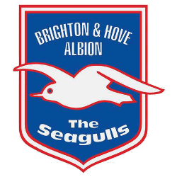
Brighton & Hove Albion FC
The club’s current crest was introduced in 2011 a modernized version of their 1977 iteration. The seagull is now flying the opposite direction than past marks with an encircled wordmark “BRIGHTON & HOVE ALBION” in blue on a white background.
Brighton & Hove Albion FC
2000 - 2011
For the 2000 season, Brighton & Hove made a slight change to the mark by removing the initials and adding the full name "BRIGHTON& HOVE ALBION" in white above the soaring seagull.

Brighton & Hove Albion FC
1998 - 2000
In 1998 Brighton & Hove went to a more classic shield shape that also featured the clubs initials and nickname "B.&H.A.F.C." and "The Seagulls" in white.
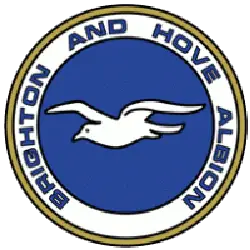
Brighton & Hove Albion FC
1978 - 1998
Brighton & Hove amended their crest in 1977, featuring a soaring white seagull with an encircled wordmark "BRIGHTON AND HOVE ALBION" in blue on a white with gold trim background.
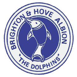
Brighton & Hove Albion FC
1974 - 1978
The club became known as the Dolphins in 1974 and, at the start of the following season, produced a new crest featuring the mammal, yet both the nickname and crest became short-lived. Featuring a dolphin centered with an encircled wordmark "BRIGHTON & HOVE ALBION" and "THE DOLPHINS" in blue.
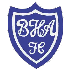
Brighton & Hove Albion FC
1970 - 1974
A blue with white border shield with the initials in a custom font "BHA" and "FC" in white.

Brighton & Hove Albion FC
1948 - 1970
The club’s original crest features the arms of Brighton and Hove, set against the club colors of blue and white. This traditional design was used after the Second World War until about 1974.
Brighton & Hove Albion FC Primary Logo
Brighton & Hove Albion Football Club is a professional football club based in the city of Brighton and Hove, England. The team was founded in 1901 and has been playing competitively since then. Over its long history, the club has had many different logos representing it throughout its time in existence.
The first logo used by Brighton & Hove Albion FC was introduced shortly after its formation in 1901. It featured a shield-like shape with two soccer balls on either side of an ‘A’ for ‘Albion’ written inside it along with four stars above it to represent each corner of Sussex County where the team plays home games from time to time. This logo remained until 1911 when they changed their name to 'Brighton United' which led them to change their badge as well - this new design featured an eagle holding a ball within a crest shaped like that of Britain's Royal Coat Of Arms at that period.
In 1974, following several changes over the years including one featuring three seagulls flying around and another ball symbolizing freedom, they returned back to using mainly blue colors on all badges afterward (as opposed to before when other colors were also present). The current primary logo features two overlapping circles containing both white and blue stripes respectively along with "BHAFC" text above them showing off how far they've come from those early days. This particular version was adopted officially in 2017 but some variations still exist today such as ones without any text or just having one circle instead; however, these are not used very often compared to what we see now thus making this design stand out more than ever before!
College Sports Fan Products


Brighton & Hove Albion FC Fans, Time to Make Your Mark!
Click to go to Premier Logo Battle and vote


