
Manchester United FC
The upper part of the inner shield of the Manchester United crest displays a ship that actually originates from the Manchester City Council coat of arms (a ship can likewise be found on Manchester City’s logo). Below the ship, there is a bigger drawing depicting a devil – the devil was first incorporated on the crest in 1970. A minor change was done in 1998 when “Football Club” was removed from the bottom banner. Instead, the banners only text out “Manchester United.”
Manchester United FC
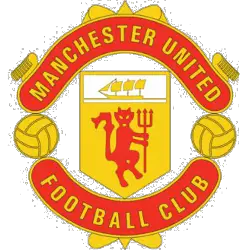
1973 - 1998
In 1973, the colors have changed slightly, however continue to be red and yellow. A red and yellow banner across the top with a wordmark "MANCHESTER UNITED" and below is a red, white and yellow shield with a ship above a red devil holding a pitch fork with two football on either site. On the bottom is an arched wordmark "FOOTBALL CLUB" in black.

Manchester United FC
1970 - 1973
In the '70s Manchester United made changes back to a more familiar crest. The crest is now only red and yellow. Again wordmark "MANCHESTER UNION" with the shield that has the ship on top and continuing with a striped banner on the bottom with two footballs on either site. Below is a wordmark "FOOTBALL CLUB" in yellow on a red background.
Manchester United FC
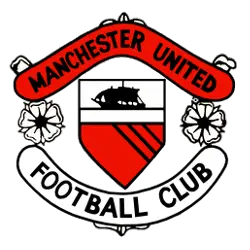
1960 - 1970
In the '60s Manchester Union changed to a angled red and black wordmark "MANCHESTER UNITED" above a red, white and black shield with a ship at the top and striped banner below with to white flowers on either side. At the bottom is an arched shaped wordmark "FOOTBALL CLUB" in black on a white background.
Manchester United FC
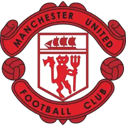
1943 - 1960
Major change to the Manchester United crest in the '40s. A red and black banner across the top with a wordmark "MANCHESTER UNITED" and below is a red and white shield with a ship above a devil holding a pitch fork with two football on either site. On the bottom is an arched wordmark "FOOTBALL CLUB" in black.
Manchester United FC
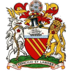
1902 - 1943
The original crest was gleaned from the logo of the Manchester City Coat of Arms. All that remains of the original crest is the ship in full sail.
The golden bends in red are derived from the arms of the Lords of Manchester, who ruled the city prior to 1301. The chief shows a ship in full sail, a symbol of trade and enterprise. The crest shows a globe covered with bees, representing the world, to all parts of which the goods of the city are exported. The bees are a symbol of activity. The supporters, an antelope and a lion, are derived from the arms of King Henry IV, Duke of Lancaster.
The motto means "By council and work," and is derived from a phrase in Ecclesiasticus 37:16 : "Let reason be the beginning of every work and let counsel go before every action."
Newton Heath
1891 - 1901
The yellow and green crest from Newton Heath has a shield with a football on top. A green and yellow striped banner is attached at the bottom of the shield.
Newton Heath
1878 - 1891
Manchester United original name, Newton Heath LYR Football Club was established in 1878. The club was found by the department of railway depots in the Manchester Newton Heath area. During this period, the team mainly consisted of workers of the railway company and played against the teams of other departments, and in 1888, the club joined the local league. The shield, which is dominated by the yellow and green and the featured train.
Manchester United Logo History: From Past to Present! Logo History Highlights!
In this video, we explore the history of the Manchester United logo, from its earliest designs to the modern emblem we recognize today. Each version of the logo tells a story of the club’s rich tradition and success.

Manchester United FC Fans, Time to Make Your Mark!
Click to go to Premier Logo Battle and vote
Manchester United Logo History
The Manchester United first logo actually belonged to Newton Heath LYR, featuring a simple train-related emblem. However, after the club was renamed in 1902, they adopted the Manchester City Council coat of arms for major finals. Therefore, the Manchester United FC logo initially carried the image of a sailing ship and a globe. This ship remains a permanent fixture in the Manchester United logo meaning, representing the city’s rich history of international trade. In the 1970s, the club officially introduced the "Red Devil" to the center of the crest. This bold move replaced the three yellow stripes of the Lancashire coat of arms.
Furthermore, the club refined the Manchester United FC logo in 1998 by removing the words "Football Club" from the bottom. This change aimed to modernize the brand for a new digital era of global marketing. You can visit our Manchester City FC logo page to see how their local rivals also utilize the iconic Manchester ship. By simplifying the design, the Manchester United logo meaning became even more focused on the club’s fierce competitive spirit. Ultimately, the gold and red color palette ensures the crest stands out on every continent. Consequently, the Manchester United FC logo continues to represent a legacy of unmatched domestic and European success.
The Manchester United FC logo serves as a bridge between the club’s industrial roots and its modern dominance. You can visit the Manchester United history page to learn more about the trophies won under these various badges. We provide a complete visual timeline of the Manchester United first logo and all subsequent redesigns for historians. Every detail in the Manchester United logo meaning, from the ship to the devil, tells a unique story. Consequently, the crest remains a sacred emblem for millions of supporters worldwide.


