
Crystal Palace FC
In advance of the 2013 playing season, the Crystal Palace created a new logo, which actually looks more like the 1973 badge than the 1993 logo. The now aggressive phoenix in blue and white clutching a football towering above the crystal palace in silver. A blue with a red trim banner with the wordmark “CRYSTAL PALACE F.C.” in white.

Crystal Palace FC
1994 - 2013
While the following badge preserved the structure of its forerunner, the eagle now had a more aggressive, eagle-like look, as the club’s chairman Ron Noades supposed that the bird from the old logo could have been easily mistaken for a phoenix.

Crystal Palace FC
1973 - 1994
Malcom Allison arrived as manager in 1973 and totally rebranded the club. He changed the shirt colors to red and blue stripes, with the Eagles nickname, and a 'phoenix' looking eagle to represent the rising from the Crystal Palace ashes was displayed with the palace in a new club badge.
Crystal Palace FC
1972 - 1973
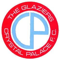
This simple design without the Crystal Palace was chosen by the club after they held a competition amongst fans for the 1972 season. Encircled wordmark "THE GLAZIERS CRYSTAL PALACE F.C." in white on a red background. Centered is the initials "CP" in blue.
Crystal Palace FC
1967 - 1972
Diagonal wordmark scripted "Crystal Palace" in yellow on a red background.

Crystal Palace FC
1964 - 1967
Blue and red half shape designs with a gap.
Crystal Palace FC
1960 - 1964
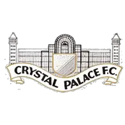
A more elaborate version of the famous glass building was adopted in 1955 by the Glaziers. A flowing white with gold trim banner in front with wordmark "CRYSTAL PALACE F.C." in black.

Crystal Palace FC
1955 - 1960
Although the club was founded in 1905, no official club crest was used until the late 1940s when an image of the Crystal Palace with a claret and blue shield was produced.
Crystal Palace FC Primary Logo
Crystal Palace Football Club has a long and storied history, dating back to 1905. The club's primary logo is a symbol of this rich heritage and has been through many iterations over the years. This essay will explore the evolution of Crystal Palace FC’s primary logo throughout its history.
The first iteration of the Crystal Palace FC crest was introduced in 1924, featuring an eagle perched atop a football surrounded by laurel leaves with “CPFC” written underneath it all. This design remained unchanged until 1972 when it was replaced with an updated version that featured two eagles instead of one as well as some minor changes to the text underlining them both; “Crystal Palace F C” became simply “Palace". In 1987, this design underwent another transformation that saw several additional elements added including stripes on either side and more intricate details such as stars around each eagle's head while retaining most aspects from previous versions like font style etcetera.
In 2013 yet another redesign took place which removed almost all traces from earlier designs except for two eagles at the top - now much larger than before - along with new colors being used for them (red & blue) and "CRYSTAL PALACE" written across the bottom in bolder capital letters than before; also present are three lions arranged diagonally just beneath these words representing England national team emblem (which have since become part-and-parcel). Finally five years later in 2018 final touch-up happened where the color scheme changed again – now lighter shades were used – making the current version look even more modernized compared to any other previously seen logos!
Overall, Crystal Palace Football Club has gone through numerous changes to its iconic primary logo over time but still manages to retain its classic look despite various updates made throughout decades since its first introduction back 1924 era! It remains one most recognizable symbols not only English Premier League but worldwide soccer community thanks largely due recognition given by fans who continue to show love and support year after year no matter what shape or form the badge takes on next...
College Sports Fan Products


